Monday 28 March 2011

Knew I kept them for a reason!


Well it's sketch time at LESS IS MORE....mmmm.....I have a bit of a love/hate relationship with sketches.....but I like a challenge.... and FAB N FUNKY have "a do it more than once" challenge (multiple folds on a card), so I decided to flip Mandi and Chrissie's sketch and add in some extra folds for a little something extra (also wanted to use up more scraps!!) I took a couple of 10cm wide strips of card scored a couple of flaps either end of the longer white strip and created a hinge on the black strip, leaving it long enough to tuck under the white flap on the right.


I then attached these together with photo glue (nice and repositionable).


The wonderful little image was from Meljen's designs which I found through Free Digital stamps. The image is perfect for my husbands Anniversary card (he's and electrician so particularly apt!)


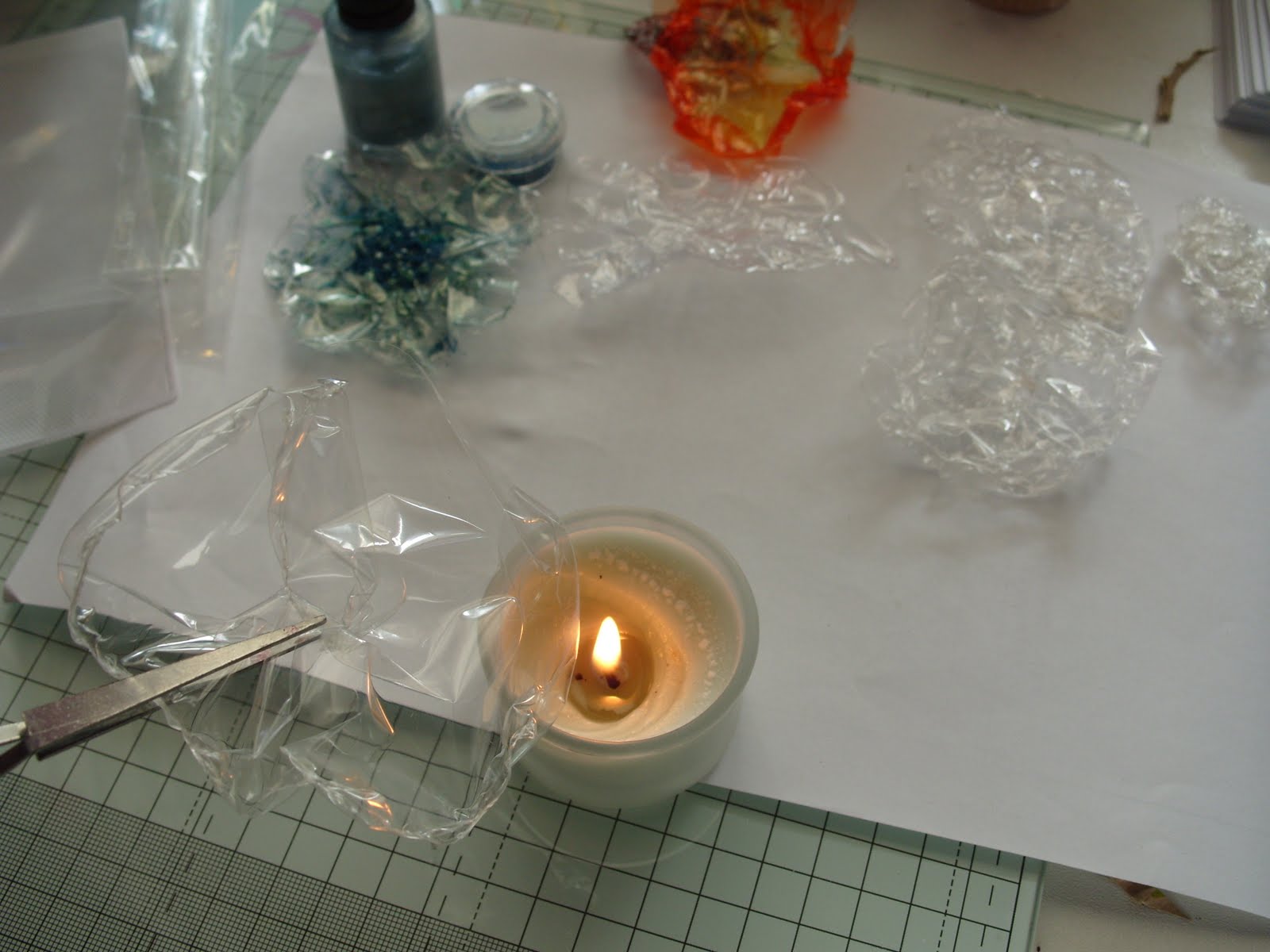
Again I was faced with colouring an inkjet image without promarkers!?! chalks were too dull.... it was then I decided to go in for the kill......lurking in my gel pen draw were some flourescent gel pens inherited from my girls......I actually thought they were disgusting but as I never throw anything away......I felt sure they would come in useful for something......


....FINALLY their moment to shine (literally) has come....and incredibly they still worked (they are years old!!!) I did find that the printer ink could still be picked up with these but as they were a fine rollerball I could manage to colour in carefully without to much disaster. In fact I was impressed how well they flowed and blended, but to give it a finishing shine I covered it in clear nail varnish....three coats...had to do a third as I managed to stick my thumb print on the second (ooops, wasn't dry!).


I created the message in Word and highlighted the "light" word with the gel pen, Mandi (Less is More)has done a clever little tutorial on matching font colour to computer generated images, I really must have a go at this. It's so nice to have such helpful tips, it's fun joining in challenges but learning something new is a great bonus.


Now for the big question. .....is there a crafting black hole/Bermuda triangle?


Last week I had to do a bit of batch card making, I am completely rubbish at tidying up as I go along, so gradually the desk disappears...and so does things that I need....as I worked I lost my lovely metal handle Swann Morton knife, my Fiskars double ended embossing tool, my medium embossing tool and the new disposable Swann Morton knife I got out to replace the missing metal one! Now my lovely little craft room (was Gina's bedroom, so it's a special place for me), is not very big, so they cant have gone far,....... I surrendered and tidied everything back in it's place......STILL MISSING...this is nuts they have to be here.


Every week as I am nosing round blogs I see WOYWW where lovely crafters take a snap shot of their desks etc and show whats there.....


......well I have decided to start WOYCSF (What's on your craft space floor!!!!!!) because this, during my search, is what I found hiding..... and I didn't know they were missing


and you guessed it.....no knives or embossing tools ????????????!!!!!!!!!!

They are officially .......Looooooost ........innnnnnnnn........Spaaaaaaaaaaaace!?!


Friday 25 March 2011

CHEATING...but bargain cards

Apologies first, my blog is primarily about making cards without purchasing anything special just card and glue, but as I still make lots of cards for other reasons as well and as these cards were made as frugally as possible, I thought I would do a quick post about them.

I supply my niece with batches of cards which she sells in her Pub on the Norfolk Broads. She and her husband work very hard to raise a lot of money for the R.N.L.I, she keeps a basket of cards on the bar which she sells and keeps the profits for her charity. With this in mind I try and make the cards as economical as possible and I soon realised the best sellers were the CAS style (didn't know it was called that then).

I received an emergency text the other day that despite taking a fresh batch last weekend, they had all gone! so I have had to make a quick fresh batch. I make as many male cards for the pub as I do female, so thought I would enter this one into Less is More's Masculine challenge, the whole batch took me half the time that previous entry did, which did turn out to be of a fiasco!! (thank you to the lovely people who left me supportive comments!).

This little guy is from an Inkadinkadoo set and I have coloured him with promarkers, but I wanted a little bit more texture than flat shading so I dotted a couple of different shades over the base layer, then dotted the blender pen to create further detail. I actually think this style of colouring (bit "pointillism" effect) could be achieved with felt pens....will have to try this some other time. The stamping is far from perfect. I love the image but as they are clear stamps I find I don't always achieve the same crisp finish as with rubber. (my excuse and I'm sticking to it....."a bad workman always blames his tools" .....fair comment I think ...gloss over that!).


I used a couple more of the "Humorous Birthday!" set, another Inkadinkadoo Camping set (there are also lots of campers and caravaners on their site) and an image from Earnies 99p stamps (fab little, usable clear stamps, great value)


I also did some other stamping techniques, I stamped the bikes on a scrap of fantasy acetate film, this gives a great 3d effect, again very popular with the lads of all ages, also did some waterclour effects, with the Sheena Douglas Creative Expressions pub (needless to say popular), and some lovely unmounted rubber stamps from Xelacrafts. I have had these for ages and have used them countless times....for some reason the lady is VERY popular. Joking aside I actually think she is gorgeous.... "a bottom to aspire to", good job mine is behind me and I don't have to look at it!! lol....... I know it isn't that shapely!!!!!

Despite typing fast (miracle) my time is running out and I must go to work. If I don't get to visit you and comment I apologise, I wont be back till later and know I wont get much time but I always keep an eye on the wonderful inspiration everyone provides....

HAVE A GOOD DAY ALL!


Tuesday 22 March 2011

NOT....to plan!!


SOMETIMES I have a lovely clear idea in my head for a design.....SOMETIMES no matter my good intentions it just doesn't go to plan.

LESS IS MORE has a "masculine" theme this week.....great..sometime ago I scanned some denim fabric and it prints brilliantly and I have made quite a few successful cards (the blokes/teens seem to have liked them) with it.

With the CAS style in mind I thought my "white" space would be denim this week.....with a simple focal point of a circular sentiment with a couple of small mock rivets...........

First the printer ran out of ink.....ended up with some very pink hued denim (not great for blokes). Plus I couldn't find the sentiment I wanted...so had to quickly make a text box message....made that too big!


Cut and scored the card, hoping to lose the worst area of pink....was so busy thinking of a redesign I scored it completely in the wrong place and ended up with uneven sides .....ok.....best of bad job decided to attach a nice navy textured scrap of card that I had found to extend the front panel.

Decided to ink the message (disguise the pink) went too mad with the ink (getting flustered now ....should really leave it alone).....ok..... will distress and sand it to lighten...although not sure that these are great techniques for CAS, IN FACT....I can decidedly feel the CAS slipping away, really should leave it alone now and come back. No. I carried on and inked and distressed the base card.....getting carried away now!


Panel needed more detail so rounded up a couple of old drawing pins...they didn't match (distressed these with a file), bent the pins over (hammer...that actually felt good!!) and attached them through the card.


Design was still lacking...OK...... will do some jeans style stitching on the join....great... test piece went well....


The card........didn't!
......will now have to use an insert (will draught print the denim and make a matching insert later.....need ink first!)
The stitching was so wonky (hadn't been drinking honestly), I had no choice but to stick the message over the mess.
PLEASE tell me I'm not the only one who can so completely get things wrong....my advice to myself, if I'm doing any of my cards is "when it's not working.....LEAVE IT ALONE!!! come back later"
Why did I not take my own advice?????


Monday 21 March 2011

Scrap box birthday.

This is a really economical card to make as it uses just a few scraps and a free digi image from CRAFT CREATIONS. The base cards was also created from a sheet of their new value pack of POPSET CARD, which I have to say is amazing quality for such good value, (I tried it with promarkers and it works well those too). At 10p a sheet it really is worth cutting and scoring your own blanks.

I created an embossed panel on the front with my new and improved embossing tool!!!

My original tool was only 6" long and the embossing ridge was made of card. I felt this didn't create a totally crisp edge. This time I used an old 12" ruler and attached it to a piece of a plastic chopping board/dinner mat. It is important to make sure that the ruler is attached in line (allowing a 5mm ridge) with the embossing edge or you will end up with a uneven panel when scoring. This time I didn't bother attaching the embossing tool to a bottom mat, it seemed unnecessary. Further details of my original design is here. I will now make a proper version as I think this works quite well... will post more detailed instructions later. It really can turn any scrap into an embossed mat that looks just like an embossed nestabilitie shape. As the picture above show you can also emboss directly on the base card quite easily, the worst bit that took a bit more care was down the spine.

Once the base card was created it was simply a case of draught printing the image, attaching coloured card over the image then reprinting. This was repeated on all the coloured pieces.
Each element was cut out of the required colours.
The chocolate cake was highlighted with a white gel pen (a correction fluid pen also works well for this).
The card was assembled and a present cut from the scrap card, decorated with a silver gel-pen and finished with a mock bow. A few salvaged confetti sequins created some movement over the design.

This card is created for a 5oth birthday, don't worry the recipient will not escape a reminder....it will have a lovely great big 50 inside........she's not getting away that lightly!!

And as it is with a CRAFT CREATIONS IMAGE I will enter it for their march challenge.
PAPERTAKE "Triple Tastic" challenge (my card has three balloons!)
SIMON SAYS has a birthday card challenge
DYSU wants a bow added.
and PAPERPLAY wants embossing.


Tuesday 15 March 2011

STICKING MY NECK OUT!!

Ok I have precisely 40 minutes to make this card and get it posted!!
The card actually only took minutes to make "Looks Like it" .... I know..... but it is meant to be exactly what it is (does that make sense?)......when I first started my blog my main aim was to prove that cards didn't have to cost lots to make, no special products needed to be bought, it didn't need to be made in the mould of established techniques, or taken up as a hobby, the most important ingredient was taking the time to make something unique for someone else.

As I hopped around yesterday I came upon the "One Layer Wednesday" at Simplicity.... a truly amazing blog...and just as amazing was her challenge to use inspiration from a Pinterest Site and wow what inspiration, I spent ages looking at all the fabulous things (I have always collected pictures, quotes etc to inspire me but here was a great new world to browse...head was spinning with ideas). It was when I was looking around Marta's quotes we received a phone call to say a relatives long awaited operation had been cancelled.....again.

It then occurred to me as I was looking at the site that I was so busy making cards for my blog (and if I'm truly honest ...to impress other cardmakers) I was forgetting sometimes the card is just about the sentiment.

So Malc this is for you......need I say more!


Now I am going to stick my neck out and be brave and enter the challenge as I am truly grateful for the inspiration.
One of the quotes looked handwritten and was washed with colour (out came the trusty felt-tip pens for my watercolouring). I even took inspiration from Marta's blog header and made a mini card from the stack of memo cards I keep on my desk.


My card is not in the league of the incredible crafted examples that have been created for this challenge. So many people have now turned card making into a true art form, which I so admire, but hopefully no-one will mind me waving my little flag from the "homemade" corner.


Monday 14 March 2011

CARD CRAFT S.O.S!!!!


This is a quick rescue of the second card I created in my previous post, I got carried away with the beaching and ended up with a horrid uneven panel along the bottom.

I have simply machine stitched a scrap of black card, attached this over the damaged area and trimmed down to fit, then added a PC printed message.

This card started out as clean and simple for Less is more but now perhaps best suited for some other challenges
The STAMPMAN is looking for Florals (with Mother's Day in mind), I love the chance to make a card in honour of my mum, She passed away 14 years ago but she will always be with me and I love the chance to still make her something special as she was a truly special person.

BEE CRAFTY is also looking for Spring florals but this time in a digi format......until the card was rescued the entire design was created on the PC with a free digi (downloaded ages ago) from FRED SHE SAID.

POLKADOODLES has a colour challenge of black, white and ONE other colour.

Then I began to wonder, as the card was no longer CAS.....

perhaps it needs something more?

SUGAR CREEK HOLLOW has a handmade flowers challenge and DARING CARDMAKERS suggested "homebaked" (homemade embellishments). so........

Laying in front of me on my very untidy work surface was a scrap of ribbon cut from a scrap that I used on Katie's card last week!!!
With a quick running stitch I gathered the ribbon and stitched to secure, I then noticed a little black headed pin on the pin cushion which I pushed through the centre of the flower then used the pin to tuck behind the black panel....I was going to stitch on a button but I liked this better.

Really this card was destined for "recycling heaven" but actually I was quite pleased with both rescue options...so it's thanks to the challenge sites for some inspiration!!.... I think I now have quite a useable card.


Sunday 13 March 2011

OFF THE PAGE AND A STEP TOO FAR!


Can't believe another week has gone and it's time for the next LESS IS MORE CHALLENGE. It's the week I slightly dread ONE LAYER CARDS, this time the theme is OFF THE EDGE.

Yikes!! this was going to be a challenge without stamps. Especially as Chrissie and Mandi at LIM decided to up the game by decreeing "no embossed lines".....rats..... just when I thought I would continue with my "Faux" faux nestie technique from the last challenge, but this is what I love about the site, they continually push the boundaries!!!

WELL.....The only way I think I was going to achieve this was to design on the computer and then chop the card down to size, BUT, this is a budget crafting blog and the idea of wasting card made me slightly wince!! SO..... I decided the best thing would be to create a design on A4 which would then cut down into two A6 long cards, this way my design could also not only be.... off the page........

but over the page.........


......and inside the page!!!


I used a lovely little free digi I got sometime ago from FRED SHE SAID. I copied the flower and pasted it several times across the middle of an A4 landscape page in Word (set margins to minimum). I then opened another page, used the same settings and created two columns. At the bottom of the columns I created the messages. I then printed both pages on the same sheet, reprinted the flower design on the inside.

I love carrying the design onto either the back or inside the card when I use my stamps..to be honest I don't often do both on the same card!!!!

To enhance the design I painted inside the image with neat bleach,leaving some highlights of yellow card (avoid the printed lines as these can smudge).

So I was pleased with my first card.....but decided to push the design a bit further for the second.
  • I highlighted the scrolls with bleach...pleased with that

  • Added some dots on the little flower....liked that

  • Decided to create a bleached panel over the message....carefully masked the area with rulers and tape............YUK WHAT A FAILURE!!

A step too far......


Will now have to rescue this card!!!!!!

The rescued card is now here


QUICK TIP:- if cutting and creasing your own printed card , it's worth putting the folded card inside a piece of clean paper before you finally neaten the crease.....
.....on my first card I discovered too late that even though the ink appears dry it can drag across the clean areas!!!


Not sure if you can see but by using a paper the ink transfers onto the paper ....not the design!

Thought these cards would be suitable again for PAPERTAKE as this time the cards have a bit more Lemon Zing

And as SIMON SAYS made me so welcome last week even though I had a hand drawn image I thought I would join them again with a proper digi image.

CREATIVE CRAFT CHALLENGE is all about thank you's this fortnight, so my first card should fit in with that.

and my final challenge is a new one for me ONE STOP CRAFT CHALLENGE who are also looking for clean and simple.

Just realised my photography is absolutely rubbish.....the card was a beautiful lemon colour and doesn't show in the main pictures....how disappointing :(


Thursday 10 March 2011

HAPPY BIRTHDAY KATIE!!

Two posts in one day and with a cut finger (see previous post)!!!

I have just finished this card for my daughter.... 23 today(just edited this post!!!). I spent ages trawling the internet looking for a cottage image for her card(she is now in the middle of buying a very rundown cottage...it's all a bit of an adventure and a bit nerve wracking....but more about that some other time).

I just couldn't find what I was looking for...but as I was waiting for my computer to load up (also see previous post...it was obviously getting sick last night), I found myself doodling and this morning I realised that is what I really wanted so I used my DIGI TO SKETCH technique to reproduce the design


I retraced a couple of the elements to add some extra layers....also very handy as I smudged the door handle on the bottom layer.

For this project, I took it an extra step by going over the pencil line with a fine permanent marker.


I water coloured the image with pen ink (as per the Digi tutorial), then cut out and stuck the elements onto Kraft card, I then added some doodled details and wording.

I have SUZE BAIN to thank for the inspiration for the card she did last week (beautifully coloured houses) and VICKY for the idea of setting the houses against the Kraft card.
They are both stunning cards.

The design was finished with a scrap of ribbon stapled on in a mock bow...I used a little mini stapler which belonged to one of my girls, the bottom is a bit broken but it has got some lovely coloured staples with it!! My husband was pleased with the card but felt it needed some detail lower and suggested adding some tufts of grass.................sometimes he has good ideas.....just as well as it's his fault my finger is cut.

I was inspired to use pastel colours again as that is the theme at Less is More and this will the first time I have made two entries.
and
DYSU has a new challenge of layers...and finally I get to play along with them again ...twice I have made samples and twice I haven't made the deadline!!!!
and although the card is very much muted pastels I gave it a bit of ZING with some LEMON ribbon which is the challenge over at PAPERTAKE.
plus this week is ANYTHING GOES at SIMON SAYS


"Faux" faux nestie!

Well the ladies at Less is More have done it again, some brilliant samples, great challenge (pastels) and another fab technique.
It's such a simple idea that gets more from your nestabilities, it's a great technique that allows you to emboss different size shapes.
It's brilliant,.... the trouble is I am still avoiding using my cardmaking things! BUT I really wanted to recreate the look! I am actually not very fond of matting and layering so this is such a simple way to create depth without using lots of card and fiddling!!
SO... I had a go at making my own embossing board, actually it worked quite well but does need perfecting!


I stuck a scrap of heavy cardstock (approx 320gsm) on a piece of packing board (chipboard type card).
Then put some 4mm marks down the front edge of the green card (this is the measurement of the blank space on the end of my ruler) I stuck the ruler on with double sided tape lining up the edge of the ruler with the pencil marks and the top edge of the board.


Instead of an embossing tool I used the end of a knitting needle (lubricate by rubbing the tip on a candle), if I'm honest I think the embossing tool works better, but this was O.k
To form the square start embossing from the 0 on the ruler and stop 4mm from the end of the card, turn the card and repeat on all sides.

I did find the 4mm border slightly to "heavy" for my project so I trimmed it down to 2mm.
The Panel was created on the PC, (thanks again for the text box tutorial ladies) using a free image I got quite along time ago, but it does appear to be still available on the internet, a recycled button finished the look. I originally faux embossed the topper as well but felt this was too much...so I trimmed it off!!


Big thank you to everyone for advice on my scrabble card, have now made my friend's card and thanks to some good advice... have place the tiles bottom right and added a stamped greeting top left! (I have to use my proper stuff sometimes....I get withdrawal symptoms if I don't).

If I don't get to comment on your card I apologise, I have had a bad morning, earlier my laptop had a serious meltdown!!! lots of blue and black screens, dire warnings, prompts to restart, hit F keys, failing to reboot and generally threatening to blow up. So like a good girl I totally unplugged it and left it to sulk...... this appears to have worked ...apart from running some checks, everything appears to have sorted itself....is that wishful thinking!! but I hope it lasts long enough to post this and then the fun bit of hopping around to see what people have created!
PLUS while the computer was sulking I cleaned the bathroom....big mistake I then cut the top off my finger on Steve's brand new razor (note to Steve...GROW BEARD!)....typing this has been challenging....
and have now got to make Katie's birthday card.....blood on card not a good look!!

Would also like to play along with this card at DREAM VALLEY as they have a new beginnings theme.


Thursday 3 March 2011

A5 x 2 = SQ

I am still endeavouring to use up scraps of card rather than use new card blanks and I use this style of card quite frequently it's a great way to use up lightweight pieces of card.
For this card I took two A5 pieces of card, the green card had a bad mark on it, so creating the base card this way conceals defects quite effectively.


Simply lay two pieces of card together, slide apart to the length required and attach together with glue. I used photo glue as it allows for a lot of manoeuvrability and any excess can be wiped away. Trim the width to half the length created, score and fold to create a square.

As my sewing machine was out (a rare event) I decided to add a stitched detail on the joints both on the front and on the inside.
For the focal point I wanted to use some old scrabble tiles (bought very cheaply from a charity shop as the set was damaged). That was the easy bit......the bit that I have spent the most time on is .........WHERE TO PLACE THE LETTERS!!!!!!??????

Less is More has a recipe of using 3 squares....which is great, as ultimately I want to recreate this card for a friend (3 letters in her name ....and a scrabble fanatic)

So where oh where looks best

No.1 (pic. at top of post) Sticking my neck out a bit.......but does it look unbalanced? (the card not my neck!!)

No. 2 is my standard format and where I always seem to settle for....bottom right.


N0. 3 Getting brave...very rarely place things centrally...so formal!


No. 4 I like ...but does it cram all the details together too much??


N0. 5 getting adventurous......


No. 6 Really getting quirky?????

Seriously need some advice.............I am truly rubbish a decision making., BIG thank you if you take the time to leave me a comment on this one
(and thanks for all the really lovely comments last time....I truly appreciate it).

Just realised haven't photographed the inside....just need to charge the camera then I will try and add pic as I love the reverse effect inside this style of card.


Wednesday 2 March 2011

Melting Madness!!!

I have truly broken my new years resolution with this card....more grunge than keeping it simple. Everything is recycled of course, the wonderful string came on a parcel from e-bay last week and the flower is some packaging from a packet of pears, even the quote was destined for a "proper" card but I got a mark on it so couldn't use it as the card was for sale.
The quote reads "True friendship is like peeing your pants. Everyone can see it but only you can feel the true warmth".... a bit tongue in cheek but this has always proved popular when I have used it on a card
I have been having a fun time melting things.... heaven knows why!!! but as I was tidying up the kitchen I found myself forming the packaging into a flower. I wanted it to hold it's shape so switched on the gas ring and slowly melted it. I was quite pleased with the result it makes a very light weight flower and quite uncrushable for posting


I carried on playing in my craft room trying different sorts of cellophane, WORD OF WARNING!!!!!, one piece of packaging let off some horrible fumes and whilst none of them actually caught fire maybe it's best to have a tub of water nearby to extinguish any that might and certainly hold the plastic in tongs or tweezers.
I also tried with my heat gun....this was not so successful as using a flame, which was far more controllable.
I found layering some of the flowers quite effective and I tried decorating one of the test pieces with some pound shop nail varnish and some little beads that came from an accessory set that I picked up some time ago in a pound shop.


I created my own background paper with an old book page scrunched and tinted with pen ink (spritzed with water).


To disguise the mark on the quote (Printed on the PC) I inked round the edge with my daubers.
Finally I created some leaves from corrugated card, added a button and lightly glued the string into position.

Hopefully this card is suitable for some challenges :-
PAPERPLAY has SENTIMENTAL
ALLSORTS has MAKE YOUR OWN FLOWERS
ALPHABET CHALLENGE has QUOTES
and a new challenge site DREAM VALLEY has ANYTHING GOES
DARING CARDMAKERS also has a challenge using Poundshop finds so perhaps I will enter there as well.