Wednesday 28 March 2012

Bling went bleuggh!…and “Just Because”

I’m not great at “blinging” my cards and it’s doubly difficult for my blog as I cant use any of my commercially produced cardmaking stuff…what I do have is some old iron on stones and some “Belly button” jewellery (very sparkly actually) that belonged to my girls.  I needed these for this weeks Less is Mores challenge. This week they have challenged us to combine three of the previous challenges, fab for me as this has given me chance to catch up on some challenges I missed when I fell into my blog hole last year.

I went back to Week 18 [Jun 4th]  Monochrome, Week 19 [Jun 11th]  In the Frame, Week 20 [Jun18th]  Monogram…..the only trouble is I had to abandon Monochrome as I needed to add a “touch of red” (Week 9) as the card began to look very Weddingy! (not a proper word), I bit the bullet and went for ……Week 43 [Nov 26th]  Bit of Bling.

S1052527

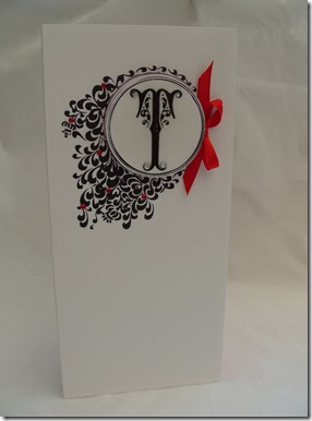
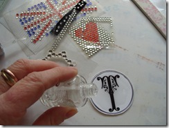
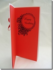
I found a fab frame here http://www.edupics.com/coloring-page-frame-i11330.html and used “RAGE” font inside a text box, to create a Monogram. I printed the design on my basecard and on a scrap of card, so that I could cut out the letter….I hate cutting out especially circles, generally I neaten cut edges by filing them,  this time I filed it from back to front to create a little gutter/ridge so that I could faux enamel the panel, it took two coats of nail polish to create a shiny finish and I found it easier to just tip it on….sadly this is where it went a bit bleauggh I had already stuck the diamantes into the first layer of nail varnish….the second layer went over them and just made them look like little clear dollops!!!!!!!!!

S1052522 S1052537

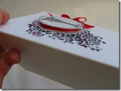
As this is a hand delivered card I went to town with the dimension and mounted the panel on corrugated card, this was covered with a scrap of ribbon tied round and finished with a bow. I loved the frame so much I decided to use it again and repeat the design on an insert but this time with the greeting inside.

S1052528

As I have sooooooo many weeks to catch up with I decided I had time to make a quick “Just because” card. These are some of my favourite cards to make….generally quite daft and for no real occasion….just because!!! I love leaving silly notes and cards for my family particularly if I think they could do with some encouragement or cheering up. I always left little hidden cards in my daughters school bags or lunch boxes….I have even hidden them in sandwiches!!!!

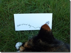
This little stone has been sitting on my desk since our last holiday and I thought he would make a cute mouse.

S1052526

Recipe for this one …..Week 18 [Jun 4th]  Monochrome (thought I better have another go)….Week 23 [July 9th] Something with Legs (if he was real…he would have legs!!!)……Week 28 [Aug 13th] Use Ink (*hang head sheepishly*…my pen had ink in it …does that count?)

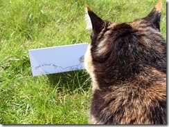
Well the card was extremely quick to make…but rubbish to photograph….I know…I will photograph it out in the sunshine…..bad idea….my very needy cat thought I had come to lay in the grass with her and of course she had to get right under my noseS1052538 so I moved it…S1052541

S1052544moved it again..S1052546

and again ……and again….        S1052547       

ok I give up…

I will take your picture then!!!!!!!!!


She’s not bad for an old girl (17!) and no she isn’t winking she only has one eye!!!

………P. S. Steve….. the grass needs cutting


Sunday 18 March 2012

Happy Day!

Happy Mothers’s day!!…I’m having a lovely pamper day, a break from the renovating the cottage, eating lots of yummy (and bad for you) stuff and of course crafting. YAY!!

This has meant I have actually had proper time to have a play with Less is More’s challenge of masking…naturally my fingers itched to use stamps but actually masking and stencilling is one of the easy ways to make cards without spending anything at all.

So it was back to the felt pens and daubers for this one

S1052510

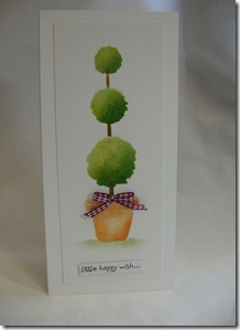
Using a knitting needle punched through paper onto a soft mouse mat, created the torn circles. I keep a pot of buttons and coins on my desks as they make handy guides for projects that need small circles. I created three bushes on my tree for Allsorts “three in a row” challenge

           S1052501  S1052502

I then drew a flower pot and using “bog standard” tracing, repeated the design three times to create different elements of the pot.  The layers of colour were created by mixing colours together, then rubbing the ink over the masks, working from one side to build up light and shade. A final bit of texture was added to the tree by stippling the darker shade on with a piece of packing foam. The stalk was added on after the leaves and pot, masking the area required with post-it notes.

         S1052503 S1052505

I did find the dauber created a very subtle shade through such a small gap, so I used an off-cut from a Memory foam insole to get the ink into the gap which worked extremely well.  To finish I grounded the pot with a little bit of shading (masked with torn paper. The greeting was part of a much larger message on a recycled Birthday card.

CONFESSION: I cant even call it a school girl error as I think a school girl would have been more careful!! but I was so eager and gleeful in my extra crafting time I carelessly  wrenched the mask off my card, which I had diligently attached with masking tape…..you can guess what is coming …….there was …a hideous little tear on the side of my card. I had even de-tacked the tape on my p.js (yes I was crafting in my jammies…how decadent is that) but there it was …mocking me…oh well I like matting white on white…so no massive harm done.

After amazing, fabulous Eggs Benedict (cooked by Katie and James…and waited on by hubby Steve). It was straight back to the craft room for another version of the topiary tree. This time with the safety net of creating the elements separately, then decoupaging them onto the card. The message was from the same recycled birthday card but this time it was cut from the inside and pleated to create a banner.

S1052516

I have only now had the chance to post this, I have spent the rest of the day with Katie and Steve. We have turned an old kitchen shelf into a house sign for the cottage(using my cricut to cut out some lettering)….. we needed a new sign as the old one was attached to the front porch….which got into a fight with a Concrete Mixer Lorry on Tuesday…the mixer lorry won!!! ……and we have all just cuddled up and watched “One Day” with tea and a packet of crunch creams.

Red heart My wonderful mum died 16 years ago and today is always overshadowed by not having my daughter Gina here (I craft in her bedroom, so it is a  special place for me) but I am lucky and privileged to have had them in my life.

Red heart to my loved ones….Thank you for this special day,

Smile……and to you all who visit ….thank you for popping by and putting up with my ramblings. …..I hope you have had a lovely day.


Thursday 15 March 2012

“Wordle” wont work

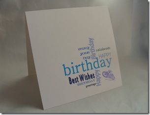
Excellent….. Less is More has “Script” for their challenge this week and I had just decided to revisit “Wordle” to create a quick card for one of my cousins. I thought a text based card would be ok for a bloke card. The colour was inspired by DYSU challenge who have asked for favourite colours (mine’s green but they did that last week, next best is Aqua….. so I abandoned my red and black theme for Aqua and blues.


S1052493The trouble is…Wordle wouldn’t work….I’ve got a feeling it’s something to do with Java….so having the attention span of a flea, I decided to abandon Wordle and just recreate the look with Text boxes and Word Art in Word. The bottom right corner looked a bit bare, so I inserted a little clip art pic of a motorbike (his great passion is bikes!) L.I.M. is one layer week but I did think my card needed a bit of a lift, luckily I had recently found a ridged ruler (in my big clearing the cupboard under the stairs frenzy) which was nearly perfect to create an embossed frame…actually it was a bit deep so I had to be careful.


S1052499 S1052500


The card was fun to create and easy but I thought I had gone off track with the theme….I looked up the definition of “script”- noun - the letters or characters used in writing by hand; handwriting, especially cursive writing, a manuscript or document, the text of a manuscript or document, the manuscript or one of various copies of the written text of a play, motion picture, or radio or television broadcast.any system of writing.


My design has got a couple of handwriting styles incorporated but I couldn’t resist having another quick go.


This is for my friends daughter who likes all things quirky so hopefully she will like a doodled/handwritten card. I decided to go all out with the Text theme and scanned a very old newspaper (hoorah for my mum being a top hoarder…mmm guess that gene runs in the family!!) which I printed directly onto card.


S1052498


Again the card was quick and simple. To keep the “white space” as clean as possible. I draft printed the text, a quick doodle later…coloured in with coloured pencils, it was soon finished….I “ummed and arrred” over a bit of ribbon for embellishment…but decided to leave it alone…if I was using my card making stuff I would possibly use a shaped brad as an accent …but card making stuff is against my blog rules …….will have a rummage around the house….. inspiration might strike!!


Have just visited LIM and spotted a card with a similar idea to my first card, Debbie has created a great design with stamps and stickers, it’s very effective, and we have both chosen very similar colours (oops perhaps I should go back to red and black!!!).


….. if any one wants itvintage newspaper scan_0001this is the scanned paper….I cant see a copyright on it and it’s old so hopefully not breaking any rules by giving the scan away…and I tried to steer clear of any mention of the macabre, murder or naughtiness…there was even mention of “wanton behaviour”….ooh er missus!!


Tuesday 6 March 2012

Prototype…..

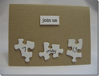
S1052484

First things first….. “family” if you are reading this….this is NOT the official date of Katie and James’ wedding (although it’s a great date…nudge nudge…wink wink …all birthday chocolate will be accepted!!!), but as Less is More are looking for Naturals this week I thought I would be having a little practice at some “Save the date” notifications. My daughter Katie is planning a very relaxed “homemade” style wedding and we wanted to create something memorable for that initial contact regarding their wedding.

Naturally the wedding will be on a budget…..the cottage has to be finished and moved into before they can actually set the date and by the time that’s finished it will leave about enough in the kitty for a bag a crisps and a panda pop each instead of a Wedding Breakfast.

…so……. these cards work out at under 10p each!! not a bad start, plus I kept them as simple as possible so they should be quite quick to produce if we form a production line.

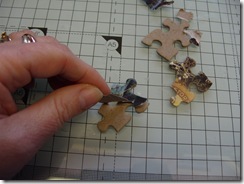
I used an old jigsaw from a charity shop, my uncle has finished with it and it now has pieces missing…it happens a lot), but at 50p for 500 pieces (oops 498!) there should be enough pieces for the project.

S1052477

First I peeled off the printed surface then coated them with a couple of coats of old white emulsion….this is going to be the most time consuming bit (messy… but it didn’t take that long). I did try lightly sanding some pieces, then painted them while they were joined together…. but I wasn’t keen on the end result…. very patchy!

I wondered as the peeled pieces looked quite nice natural, what it would look like with the reverse colour way… (needed a white gel pen for this)

S1052487

mmmm…. actually now beginning to think I like this better (I do like my white card!!!) but I am sure Katie has some ideas up her sleeve for this too….so I expect there will be many more prototypes in the pipeline!!!!