Tuesday 22 February 2011

Simply spotty!

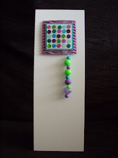
I have been having a quick play making a card for a young girl. I have kept it quite simple and in a graphic style, so I haven't put a sentiment on the front as I didn't want to break up the shapes and colours.
I found some beads from a kit my girls had a long time ago, this generated the colour scheme. I sorted out some matching scraps and used a stationary punch to add my "spots".
I turned the beads into a "hanging charm" to add a bit of kinetic interest. I felt the paper spots were dull incomparison to the plastic beads so I added some clear nail varnish over the spotty topper, to give a final "shiny glaze".


Monday 21 February 2011

Quick and simple.....I wish!!!!!


Well the afternoon is romping away and I desperately wanted to enter Clare's Weekly challenge which has a leaf inspired photo and I am determined to keep plugging on with my "keeping it simple" philosophy. Soooooooo ....I know ....I will knock up a quick card with a suitable sentiment and a bit of stencilling. ....ha ha ha ha.....this has taken me quite a bit of time!!!!... and quite honestly I know it's not quite right but as the deadline is ticking away I will post it anyway (then I really must feed my husband.....beans on toast if I don't get a move on!! he's hungry ooops).

LESS IS MORE has not only a Spring inspired challenge but some brilliant tips on creating word art. I really enjoyed exploring positioning of text but seriously know I haven't perfected it yet, not sure about the transparency thing...I had to use the "no fill" option in "format" and after creating my piece of work I found I couldn't then reposition it as a whole....there has to be away of grouping the entire piece and then moving???????? any help is gratefully received.


After I had created my word art I draft printed on paper to decide upon the positioning of my image.
I created a quick stencil by folding a piece of paper lengthways, roughly sketched one side of the leaf on the folded spine then cut out the shape. Once open I then cut the stalk.
I practiced on the draft print, then repeated the stencilling on a blank A5 piece of card.


I stencilled pen ink over the stencil using my homemade daubers (further details on the dauber tutorial). I used a yellow and a couple of greens....again I was disappointed with my colours... I would have preferred a much fresher brighter palette for spring. To create the spine detail I cut out some veins from the stencil off-cut. I reinserted the leaf and stencilled a darker colour.


I then repeated the process by shifting the stencil over to the side (first I used the stencil to cut another leaf to create a mask to place over the original stencilled leaf).
All that was left to do was print the sentiment and score the card in half. quick and simple...it wasn't.....Clean and simple...may be!?
All in all I was quite pleased. The proportions and positioning aren't exactly right, and possibly the leaves too big. I preferred it once I rounded the corners , not sure why, maybe it echoes the leaf shape and creates a bit of harmony (ooh that was a bit deep and pretentious!!).
(To round corners, place a glass tumbler on the corner and cut round with a sharp craft knife - use an emery board to sand down any blunt edges)
I love the sentiment and I firmly believe keeping it simple adds so much to the importance of the message, I hope to send this to someone I know who is feeling a bit down, as life is proving a bit tough at the moment....I think the proverb says it all.

Tuesday 15 February 2011

Printing and "Puns"

I am getting serious withdrawal symptoms from my beloved stamping. As LESS IS MORE's CHALLENGE, is.. one layer cards with a "Flower or tree" theme, I thought I would struggle, as my budget cards rely very much on "sticking things" on etc.....undeterred I decided to go back to basics......finger painting or in this case printing.
My daughter is a huge Edward Monkton fan,true to form she bought oneof his cards for her boyfriend on Valentines Day. So I made my own homage to Monkton with some little bird (sitting in a tree!!) cards complete with corny pun's ...thought this would be suitable for ALLSORTS CHALLENGE which is "all about the sentiment"

The sentiment on the front then leads inside.....


Totally daft I know (I gave the card to Katie and James on Valentines and I think they were quite amused ?!?).

Then I saw that CREATIVE CRAFT CHALLENGE is "Cards for a teens"...always tricky particularly as we have quite a few in the family!! So I thought I would adapt the design for my niece (17).
Again going for a very cheesy pun..


and I will finish the song inside!!! at least she'll be spared me singing it!


The cards are so easy to make and I even managed to resist using an ink pad...inking my finger with a waterbased brush marker.......you would think waterbased would wash off.....


WRONG!!!!!!


Friday 11 February 2011

PENCIL SHADED BOOKMARKS

How spooky...I popped on the TV while I sat down to post my latest efforts which involved something I hadn't done for absolutely ages ... when on QVC they had just finished showing a set of Martha Stewart Pencil Crayons....which I had just been experimenting with...NOT Martha Stewart's but an ancient school set belonging to my daughter (good quality but many broken leads), a tin of little pencils from a pound shop and some novelty multi pencils left over from some kids party bags!!


To be honest I actually got on with the cheapest one the best, the old school set were lovely and soft and blendable but they didn't sharpen well and it was difficult to use them on small details.
To soften edges and blend....I tried various implements and techniques (polystyrene, different erasers, foam...etc!) but actually blending with my finger worked best.


The reason I was experimenting was I realised not using my stamps on my budget cards was limiting the use of images to clip art and digi stamps from the PC and as my printer is inkjet this doesn't take kindly to watercolour techniques. One of the reasons why I created my DIGI TO SKETCH method, and of course Promarkers are out of the question as I class these with my proper Cardmaking stuff....
BUT..... what fun I had ......I had forgotten how much I love old fashioned colouring in. It was so therapeutic.
I found a lovely free image on BEE CRAFTY's Blog. this is the first time I had visited their site and despite not going in for cute images (don't really get much call to use them), I found their images charming ...quite quirky, I was even tempted to buy the cute little pair of bunnies...think they will make great Easter Cards ...."from us" style. Cant wait to have a play.
The whole exercise was a practice one, but I decided to turn my efforts into bookmarks to giveaway free to celebrate World Book Day 3rd March....instead of RAK ATC'c...these are RAK bookmarks!!!

To finish them off I raided some of salvaged ribbon stock!!!!

So now they are finished articles I will enter them into some challenges.
So many challenges had HEARTS this month (we do all like a bit of romance)
This is the most challenges I have entered and some I have never visited before so I hope I am not stepping on any toes and have followed guidelines properly...but I couldn't resist entering after visiting and getting inspired on these many great blogs.
wow!!!!!haven't I run on ......sorry!


Monday 7 February 2011

Happiness

Not a great photo...to be honest not a great card. I had in mind a design to use for the brand new challenge site Less is More, and as my resolution this year is to try and keep my cards simple I thought I would have a go... albeit with a budget make.
Possibly that is where the problem arose. I would have been happier stamping and using my punches for this. The theme of the challenge was black white and pink. The only heart sequins I had were quite a strong pink (yes I am one of those sad people at parties and weddings who gather up the table confetti at the end!) and the scrap ribbon I had, didn't really go...I should have stuck to all black.

To compensate for not being able to stamp the back detail I drew round a penny which did help create some uniformity...used an ordinary Berol handwriting pen but a smaller tipped graphic pen would have most probably worked better for such fine detail.

I am also trying to rein in on using to many new card blanks and use up some of the many off cuts that I have. I used two 10cm X 21cm pieces (I have many of these as I tend to make my own dl blanks from A4 so these are the left over pieces). I scored a 1cm hinge on the back black piece and attached the white front panel (this then had to be trimmed down slightly) I carried the faux stitching detail down the spine.
A simple sentiment printed in word finished the card....It was when I saw Creative Craft Challenge had a Hearts and flowers theme I decided to enter there as well but although my sequins formed stylised flowers I thought it should include another flower to qualify but bearing in mind Less is more it had to be subtle .... I found a little free clipart flower formed from heart shapes which I used as a watermark behind the word... and funnily enough, I really liked this one little element.
Finally I might enter this for PolkaDoodles With Heart challenge....I haven't used their products so it might not qualify but I have a big soft spot for Polka Doodle products (I once won a competition in Simply Cards Mag and I am sure using Nicky's great art work helped). It was lovely to visit their blog again. I could spend hours hopping around all the brilliant blogs out there...but if I did that I wouldn't have time to make cards or ....wash my mouth out ....do any housework!!!


Each moment....

I have created this card using inspiration from three sources,

First was Clares Challenge at Do Crafts, she has chosen a wonderful atmospheric black and white photo...so I have used a special photo taken at dawn on our silver wedding anniversary trip, to enhance the misty effect I washed over the picture with water to blend the ink.


I then cropped the image and trimmed it into three. After I lightly attached these into position with glue, I fastened them down with red thread, This was the inspiration from DYSU RED HOT challenge.... I have used my red more subtly...I found red stood out better just as a slight accent ...perhaps more of a ...slow burn rather than red hot!!!
And finally I have joined ALLSORTS again, their challenge is Love love love. This card is filled with love as it is for my husband (Valentine ...or Anniversary..not sure??), but I wanted the wording to reflect the Love element. I often think the wording or sentiment is more important than the image and decorative elements.
I created the wording in a Word document...draft printed it ...attached a scrap of vellum over the wording then passed it through the printer again. Once dry I ripped the phrase of the carrier sheet and attached it over the image. The final touch was a little drawn heart on a sticky price label, enhanced with clear nail varnish. It was self adhesive but I also attached it with a dressmaking pin.....I removed the point with some pliers...I would hate to draw blood when Steve opened the envelope!!!


Tuesday 1 February 2011

TAKEAWAY CALENDAR CARD

I've designed this card for Allsorts Challenge which is "use something not designed for cardmaking"...well as my blog is all about slightly alternative papercrafting this is really up my street... but I really wanted to use something I have never used before... so as I ended up with duplicate calendars from our wonderful local takeaway (no I do not eat that many takeaways...but my daughter's..bestfriend's...partner's...family own it!! so they are always very generous to us...thank you Christine and Darren), I decided to sacrifice one and utilise the very pretty design on a card.


In fact all the stuff is recycled. Raffia from a posy of flowers I received a long time ago, a fabric flower from an artificial bunch, old nail varnish, ordinary stationary split pins, and the card base was created by sandwiching an off-cut of brown card with a piece of ivory card


I found the calender easy to cut but found one of the edges frayed and fell apart quickly so that section I supported on the back with tape and cut through the middle.


I didn't like the shiny pin heads so I covered these with nail varnish and put some of the nail varnish in the middle of the flower to cover the hole (this had the plastic fixing pushed through the centre, which I had removed), unfortunately the nail varnish has separated and was very runny which sunk into the fabric.....LUCKILY I had saved some shiny bits from a previous
project so I sprinkled these on ...I am a serious hoarder... these were the little tiny bits that fell off the scouring pads I cut up for my Cute as a button card...but I knew they would come in for something!!!!!!

Finally as the calendar was made from a compressed paper and the back was lovely and white, I couldn't resist trying this with a proper rubber stamp...I did ink the stamp with waterbased brush markers, so again cost effective...but it still stamped beautifully. I turned this into a quick topper with a scrap of the brown card and a piece of embroidery thread, I only attached this along the top so it hangs nicely like a mini blind!
... the cards needs finishing but I will save this for when the occasion arises.

As QUICK CARDS MAGAZINE has a competition celebrating Chinese New Year I may send this off for that.