Tuesday 3 July 2012

What day is it????

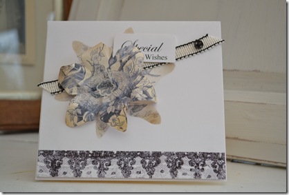
Oh dear…..I’ve done it again….missed another birthday, what makes it doubly worse is that I had the card already to post in good time and I still forgot to post it on time!!! ……………and on Sunday while we were working at Katie's cottage we had a lovely visit from Steve’s sister Val and family and guess who’s birthday it was that day………yup! Val’s ….and guess who hadn’t even realised it was the first of July and didn’t even wish her HAPPY BIRTHDAY!…….and despite having the card in my car  waiting to be posted…..I…..STILL DIDN’T TO GIVE IT TO HER!!!!!
Valerie please accept this humble and heartfelt grovel…..I’m so sorry.
With this in mind I decided to use not only Less is Mores’ challenge (take inspiration from their blog header) but Allsorts flower challenge, as an opportunity to make another special card for Val.
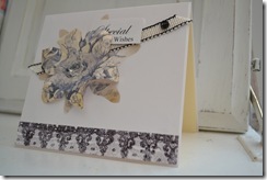
Val this is for you…..
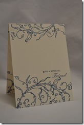
DSC_0110
I took inspiration from the colours and the multi-layered effect of L.I.M’s banner….quite difficult (I struggled) while still keeping to the CAS ethos. I’m afraid I resorted to the image transfer technique again with another lovely image from the Graphics Fairy, but used the floral theme as my focal point
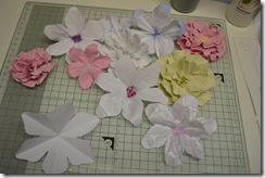
I have also made a flower tutorial as I tend to use these rather a lot at the mo, especially this Clematis shape I made to compliment Oak House Studio’s clematis stamp, which I used on my mirror project on Linda’s blog.
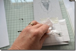
DSC_0099 This time after cutting the shape, I ironed the off-cut flat to create a stencil, then transferred the image over the aperture DSC_0100
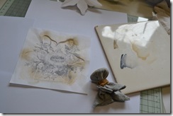

The edges also needed inking for extra definition.

The card was completed with the design reprinted and cut into a matching flower, and embellished with some sewing box bits, press studs, button and braid …..love that braid….found it in the charity shop…. 20p!! 
DSC_0108
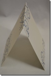
Initially I wasn’t happy with the card….the components appeared to be floating so I cut the card front off and re mounted it with lace (a scan) transferred along the bottom.
                …..now off to post this card before I forget!!!!!!!!!!!!!!!!!!!!!!!!!!!

p.s. Big thank you to Karen (The Graphics Fairy) for featuring my Image Transfered Masculine Cards on her Crafting blog, I'm very honoured as I have seen such an amazing variety of projects featured, it is a great honour that my "budget" CAS cards have made it there!!


Monday 2 July 2012

Paper flower tutorial

As I have been using paper flowers as embellishments for many of my projects I thought I would do a quick tutorial on how to make them without any cardmaking tools. I love the punched and die cut flowers I use which are cut with my cricut and punches but for the sake of this blog I wanted to be able to make usable flowers without any added expense. The great thing about these flowers is they can be made out of any paper, so can be made very cheaply from copier paper, recycled pages, tissue paper, scraps, wrapping paper…..etc!!!!

To create ……..

Use a square of paper…..(doesn’t matter if its not exact)…. fold into quarters….then  fold one third just over the centre line….then another third folds behind…you should have a three way zig zag.

DSC_0010

Draw the shape of your petal, then cut the top portion off.

DSC_0011

The shape can the be formed…petals edges can be curled…or the shape scrunched…spritzing with water or hair gel then left to dry gives the shape quite rigid and natural form

DSC_0014

… the edges can be inked before

DSC_0015

….all these flowers were test pieces made out of cheap scraps or copier paper, different shapes were cut to create different shape petals…..some were created by folding extra times to create longer zig zags….and some were made of multiple layers

DSC_0024

The centres can be finished with buttons, beads, glitter, feathers or  miniture versions of the flower……

Try making flowers out of decorative papers, book papers. if you have rubber stamps the flowers can be over stamped before shaping……

…….possibilities of shape size and design is endless and be used as an accent or a focal point…….have fun!!!!


Thursday 28 June 2012

Two for……Phoebe!

This week I have had a couple of projects to get done.  Katie’s friend Phoebe is moving into a new house this week. (plus Happy Birthday Phoebe)
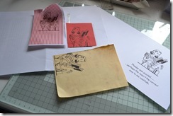
Less is More has a paper piecing challenge….fab ….despite not being a fan of cutting out (very “scissorly” challenged) I actually love the look of paper pieced images and its a perfect technique for cardmaking, without proper cardmaking equipment…just  scissors, scraps of paper, printer and of course trusty glue stick.
DSC_0097
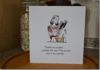
The brilliant image was free from The Graphic fairy. I love retro images like this and they lend themselves to quirky quotes…..this was perfect to make a quote for Phoebe who …..a) is a bit of a domestic goddess and b) likes a cocktail ….or two…...or ????
DSC_0096
Originally I was going to piece more of the elements but these images always look great in their original black and white form so I just highlighted a couple of elements, which I think stand out better than with lots of other detail……oh and dont look to closely at her sleeve under the book….the original piece went missing, I suspect its in the bin, I had to improvise with another scrap but the pattern isn't quite right!?!  …….. (note to self….DONT TIDY MID PROJECT!!!….goodness knows why I decided to tidy as I went along….I normally always work in total chaos).
DSC_0087
The second project was a bit of a warm up and trial piece. Katie and I worked on this together and I kindly let her do all the donkey work as the old wooden picture/tray I found in the charity shop (£3.50) had been decoupaged then varnished….and OH BOY! had it been varnished…. so it needed a lot of stripping and sanding.
Sadly we didn't think to photograph it first but this is Kate mid project….DSC_0081
We were using the image transfer technique I have been playing with lately. The text was complimented with another great image from The Graphic Fairy and its not only thanks to The Graphic Fairy for the image but also all the great inspiration I have found from people who contribute to the site, particularly the link party on Mondays.
It was  a great learning curve……the image needs more burnishing when applying on wood (back of a spoon works fine) and the tricky part was sealing the ink (inkjet printed image), Although we didn't do it on the tray, I have found that heat sealing it (iron over with a protective layer of kitchen roll) helps set the ink. We found spray varnishes work best but acrylic varnish worked well too
 ….if anyone has any other suggestions I would love to know.
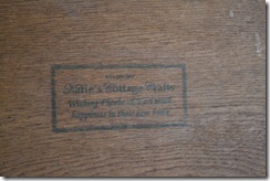
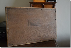
We finished the back with a “pseudo” makers label” with a personal message .DSC_0095DSC_0094
Now onwards and upwards with some much bigger projects for Katie & James’ Cottage…… it will soon be ready to move in!!!


Thursday 21 June 2012

“Two for the….

DSC_0044 (2)
….cant really say for the “price of one” as I didn’t have to purchase anything to create these cards and only needed a small amount of silicon to attach the recycled gems.
Less is More requires something shiny this week  …..handy as my daughter Katie has donated a lovely bag of broken jewellery to my ever growing stash of stuff to repurpose on my crafty projects (hoorah for cheap and poorly made fashion jewellery!!!!!!!), but I also wanted to continue experimenting with the wax paper image transfer technique I used last week…….
I have made a step by step tutorial in a separate post as  I am conscious that my posts are always a bit long winded.
Both cards were made with the same lovely free image from the Graphic Fairy, I created two cards one using the image directly printed onto the card and the second with the transfer technique to create a very different lookDSC_0037 (2)
For a shiny touch the “directly printed” card just needed a gem borrowed from an iron on motif,
DSC_0046 (2)


…..and the vintage style card was finished with a piece cut from a broken bracelet, with a co-ordinating  insert…..and as it seemed quite a sophisticated image….I translated the greeting it into french (thank you Mr Google!!!) , which  also inspired me to join in with DYSU, they have a great theme of inspired by a Movie...this card made me think of the new french silent movie "The Artist" which I am really look forward to seeing
.......anyone seen it?.....did you like it????


Image Transfer–wax/release paper

This is a basic step by step tutorial on transferring a computer generated image onto card using an inkjet printer and wax paper (or any release backing paper from sticker sheets/sticky back plastic/sticker albums/postage labels etc.
DSC_0027
1. Create your image in a graphic programme or word document and print onto your chosen release paper. I used a waxy page from an old sticker album. (I rounded off the corners slightly just to prevent it getting caught in the machine) Don't forget to reverse the image if has any text on it.

DSC_0052 (2)
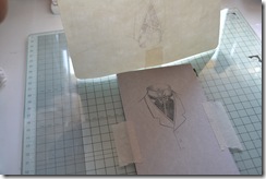
2. Ink side up work out approximately where the image is going to go on your project (this can be done more methodically but I will post details when I have experimented more!!). It helps to fix the base card to your work surface with masking tape to prevent it from moving,.


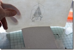
DSC_0053 (2)3. Carefully turn the wax paper over and position back over your card….have a piece of masking tape ready so that as soon as the paper is down you can anchor the image….the ink remains wet so it is important it doesn't move…. it will start to transfer as soon as it touches the card
DSC_0029
4. Lightly rub over the image to make sure all the image has made contact.


DSC_0030 (2)
5. Lift the wax sheet up and remove.

If you want to add to the project repeat the first five steps with the next design…..

“The wax paper can be lightly wiped clean with a damp tissue and reused once dry.”


. …..to continue with my project I printed on a small piece of backing paper (from sticky backed plastic). As it was small and thin I attached it to a carrier sheet                        

– first draft print the text then position the wax paper(attach with double sided tape) over the draft and print again with the correct setting.
DSC_0034 (3)


                                            ....Position and apply.


This card was created for a “CAS” (Less is More)challenge and used a wonderful image from THE GRAPHIC FAIRYthe cravat pin was a broken piece of jewellery!!
DSC_0049 (2)

Some ideas are not so suitable for paper projects but there are lots of other applications for this technique. Transferring an image gives a lovely subtle effect, I compared the finished result to standard printing for the challenge.  It really does depend on personal preference and desired finished effect as to when to use this technique, it’s also a useful technique for laying images over creative backgrounds.
Would love any comments and ideas on ways of image transferring....or just say hello
....thanks for popping by.


Thursday 14 June 2012

Image Transfer ~ Rub-ons

Something that has been niggling me for a while is how to achieve a print without my stamps.  Being able to transfer an image from my printer without running the actual card through the machine means I can be more flexible with the placement and combine other techniques prior to the printing stage……

I have explored several other ways in the past - gesso (messy, time consuming & not totally suitable for cardmaking) –wintergreen oil (works but…..whoa! Surprised smile be prepared to have your house smell ….for days!!) orange oil (smells much nicer but not totally successful) and I know there are several other ways but the simplest seemed to be Freezer Paper (Pinterest suggestion). I duly found the Freezer Paper (on e bay) and was poised at the point of purchase when I realised all it was, was wax paper…..now bearing in mind I keep all the backing from sticker sheets, labels and old pages from my girls sticker albums (use them for wiping over card prior to “old style” stencil embossing) it really didn’t seem necessary to buy more.

It’s one layer week at Less is More and they have a challenge to use a Flourish….perfect week to try the paper transfer…..only trouble is this week I have zero time to experiment so this has been a very hurried sample…

DSC_0040

I created a quick Fathers Day card  (with a difference…now hubbie is officially Father of the Bride-to–be) using text and a flourish (Florals 2 Dingbat – letter e) and flourish border created with Wingdings 2 (letters a & b) with some words hidden within (Typo upright)….then came the fun bit….. printing on the wax paper….the first bit of paper I tried was a scrap from a Label sheet stuck to a carrier sheet

Couple of Don’ts…..

DSC_0030Don’t …forget to reverse the image if you’re using text…..guess who forgot!

Don’t …forget to turn the paper ink side down before rubbing over the image….guess who’s got a blue thumb!!

HEY PRESTO !!!!!!!  it works and I really loved the soft effect….I think this will be particularly great for vintage images. It was so easy, the ink transfers very quickly, just gently rub over the back with a finger or thumb……oh another Don’t …..Don’t try and move it once its down…it will blur….yes …guess who tested this theory as well!!!

but the good news is I also discovered you can completely wipe the wax paper clean and reuse it!!

I was intrigued to see if I could actually use this technique with stamping and luckily sitting on my desk was a lovely new stamp from Oak House Studio…a beautiful big flourish!!!! I quickly stamped this with Stampin Up “Not quite Navy” ink…. then printed my wording directly on a very thick piece of wax paper (from a sticker album) and actually I surprised it blended quite well with the stamped image….perhaps a bit soft…..will have to investigate this a bit further, using different types of paper and colours!

DSC_0036DSC_0039 

I couldn't resist stamping the design over the spine……… and onto the back………oh and on the inside as well!!

Sorry this has been long winded yet again but I must also say thank you to the Less is More Ladies for showcasing my Jar shaped card (tough challenge!!) I really appreciate the support you give to my “homemade” efforts and I really appreciate the lovely comments from you and the people who pop by and take the time to leave a message

                                               SmileTHANK YOU!!!!!!!!!!Smile

p.s Check out Lynnda’s (Oak House Studio blog) stamped scarf…what a great idea….something else I must  try!!!!


Thursday 7 June 2012

A bit of stamping…..yay!!!

Well for Less is More and my blog this week I have indulged myself with a little bit of stamping. This week I have been working with  a lovely Stamp from Oak House Studio. Owner of Oak House Studio and Designer of the Clematis Stamp is Lynnda Worsnop who this weekend is hosting a 24hr event using just the one stamp in lots of different ways. I have had amazing fun experimenting  with the stamp finding different ways of using it and I have to say, for a clear stamp (laser cut in a very strong polymer…giving an impression as good as a rubber stamp) it really is very durable ….just as well as I have been extremely hard on it….thank goodness there isn’t a “Society for the Protection  of Stamps” as I wouldn’t blame Lynnda for reporting me for mistreatment…the good news is the stamp is still standing and stamping as beautifully as when I received it….

….so to prove it’s still working (despite being dunked in all sorts of inappropriate paints etc!) I have made a card for Less Is More’s Red White and Blue challenge

DSC_0067

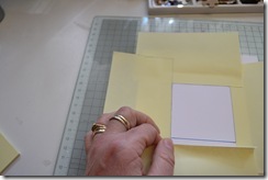
Inspired by the blue and white china I inherited from my mum, I masked off a square panel with Post-it notes (with a square post-it used as a template), then drew round the panel with an ordinary Berol Handwriting pen….despite using a stamp I wanted to avoid using bought cardmaking products as much as possible, DSC_0045so I also avoided using a bought inkpad and used an ordinary felt pelt rubbed over the stamp. As the pen was waterbased it was easily washed to colour the image….. ideally I wanted to glaze the panel but every household item I tried made the ink bleed too much and I think even bought inkpads may have the same effect….if anyone has any clever ideas I would love to know.

But with time ticking away I have left the image matt and added my touch of red…a knotted scrap of ribbon (yes I cant even throw off cuts of ribbon away…in fact I keep a tub of little scraps pre-tied in bows …and if they’re not big enough for bows …I use them knotted!!!)

If you’re lucky enough to live near the Oak House Studio, do drop in and visit Lynnda and see what she is up to (I think she will have the kettle on), if not pop by her blog (hopefully my projects will be there) I have scheduled a couple of sensible home decor projects …I am still working on a very “unglamorous” idea …..and keep an eye on her One Stamp facebook page this weekend (9th and 10th June).

p.s love the stamped watch you’ve just posted on your blog Lynnda….oooooh want one of those!!!!!


Tuesday 29 May 2012

My jar ‘runneth’ over…..

The sun is shining and I have managed to squeeze in a little “Less is More” crafting…. although my eyebrows shot up to my “very grey” hairline when I read the challenge was to create a card other than square or rectangle…..oh heck… I thought it was tricky last week creating a child's card and keeping it clean and simple ….but without stamping or using my cardmaking stuff…. I could only think of novelty style cards which were definitely not CAS…. so not sure if this totally qualifies….

DSC_0021

but it was a great excuse to use the adorable free print sheet from The Graphic Fairy  that I recently found.

Luckily I also had some printable projector acetate from a computer course I did many years ago……never have needed to create a presentation….so I still have more or less a full packet…and I thought the acetate would be perfect to print the jar on.

DSC_0010

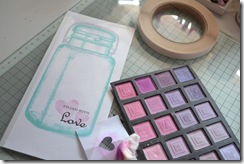
After printing the jar I created a text box to position in the jar…..then deleted the image before printing the text on card……then before I attached the acetate and card together (attached along the top with double side tape) I highlighted the text with a couple of stencilled hearts (chalked with eyeshadows!!)

DSC_0012To attach a back panel I scored the top of the acetate section to create a hingeDSC_0019 which fixed onto another piece of card

Once the three panels were joined I cut out the shape of the jar.

To finish I tied on a couple of scraps of ribbon from my salvaged stash.

I photographed the card with some confetti sequins as I am going to pop a few  a handful in the envelope…..

       ……dont you just love it when people do this!?!? Winking smile

Now must go and have a play with the clematis stamp from Lynnda at Oak House studio.…..Lynnda is planning an ambitious 24 hour craft with “One Stamp” and I am supporting her by having a go at creating some revamped home decor projects…… one of my projects is hopefully going to be immensely useful but has to be one of the oddest and possibly the most unappealing projects  I have ever created in my papercrafting!!!!!!!!


Tuesday 22 May 2012

1,2…….…..3!!!!!!!!!!!

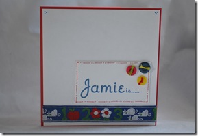
Hopefully nice and early for Less is More this week (Theme Baby or Child). Nice wide scope but I found it quite difficult to do CAS for a child…to make an attractive card for a child tends to lend itself to bolder style designs so this week my card has a bit more layering than I would normally do for this challenge, hopefully there’s enough white space and simplicity (oops a few little details did creep in) to qualify.

In honour and might I add extremely early I created a card for my youngest goddaughter who is three this year…

DSC_0034

A while ago I bought some lovely embroidered tape from the chartity shop (20P!!) and I knew it would be useful so quite simply a strip attached on a layer and a message embellished with three buttons created a simple design but hopefully bright and appealing to a child.

and just in case the message hadn’t been twigged

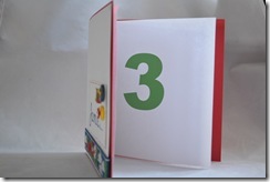
DSC_0038

a nice big three inside Party smile!

As I said…. I have made this card early……birthday in August…now all I have to do is remember I made it…… and where I put it!!!


Thursday 17 May 2012

Nappy crafting definitely not happy crafting….

Should have called this post “warts and all” as this week my idea didn’t quite work but if I’m honest it was more the execution of the projects that failed…..

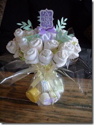
A couple of weeks ago Katie and I made her friend a Nappy bouquet (congrats on the safe arrival of beautiful Betty Rose!!)…

S1052575

….and much to Katie’s frustration she caught me “salvaging” the one nappy that got trashed in the making “Honestly mum…cant you throw anything away!!!!!”

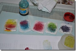
“er ……..no! and boy I’m glad I didn’t as Less is More really made my brain hurt with their one layer challenge of three stamps….its bad enough not using bought cardmaking things but to come up with three stamps that was going to be a challenge… so this week I had to do a bit of a cheat….I used some free stamps from Quick Cards Magazine.  I could have stamped with some household things in fact my third stamp was actually a bit of card but I really  wanted to have a go at making my own ink pads to use with stamps….HENCE THE NAPPY….see Katie told you I would use it!!!.DSC_0045

I have made impro ink pads before but finding a medium to successfully contain the ink (food colouring in this case) without clogging or oversaturating is not easy…..and actually its a big thumbs up for disposable nappies as they retain plenty of moisture but still allow some through when pressed…pity my stamping skills didn’t live up to expectation DSC_0056

First attempt …….started reasonably well, thought I would use the back of the stamp to create a shadow (used some double sided tape to attach the stamp onto the base of a flat bottomed glass)…but the colours were disappointing particularly the purple I mixed…dull…dull… dull ….and to top it all I mis-stamped one of the jars…all in all …insipid!

DSC_0074


Second attempt…….

DSC_0039decided to customise the pads with different colours, again shadow stamped but this time used some black ink for the outline…  DSC_0072

didn’t think this one through and ended up with a silly gap at the end, so doodled a lollypop at the end to compensate…but as I dislike the the dark colour scheme for the theme…its more bin fodder…..

one  final attempt…added a little pen ink to the pads and a really quick design just to test the pads and…..

DSC_0081

really…really… earth shatteringly….poor layout but the colours were improved…oh well back to the drawing board… Confused smile