


Thursday, 10 March 2011

HAPPY BIRTHDAY KATIE!!

Two posts in one day and with a cut finger (see previous post)!!!

I have just finished this card for my daughter.... 23 today(just edited this post!!!). I spent ages trawling the internet looking for a cottage image for her card(she is now in the middle of buying a very rundown cottage...it's all a bit of an adventure and a bit nerve wracking....but more about that some other time).

I just couldn't find what I was looking for...but as I was waiting for my computer to load up (also see previous post...it was obviously getting sick last night), I found myself doodling and this morning I realised that is what I really wanted so I used my DIGI TO SKETCH technique to reproduce the design


I retraced a couple of the elements to add some extra layers....also very handy as I smudged the door handle on the bottom layer.

For this project, I took it an extra step by going over the pencil line with a fine permanent marker.


I water coloured the image with pen ink (as per the Digi tutorial), then cut out and stuck the elements onto Kraft card, I then added some doodled details and wording.

I have SUZE BAIN to thank for the inspiration for the card she did last week (beautifully coloured houses) and VICKY for the idea of setting the houses against the Kraft card.
They are both stunning cards.

The design was finished with a scrap of ribbon stapled on in a mock bow...I used a little mini stapler which belonged to one of my girls, the bottom is a bit broken but it has got some lovely coloured staples with it!! My husband was pleased with the card but felt it needed some detail lower and suggested adding some tufts of grass.................sometimes he has good ideas.....just as well as it's his fault my finger is cut.

I was inspired to use pastel colours again as that is the theme at Less is More and this will the first time I have made two entries.
and
DYSU has a new challenge of layers...and finally I get to play along with them again ...twice I have made samples and twice I haven't made the deadline!!!!
and although the card is very much muted pastels I gave it a bit of ZING with some LEMON ribbon which is the challenge over at PAPERTAKE.
plus this week is ANYTHING GOES at SIMON SAYS



"Faux" faux nestie!

Well the ladies at Less is More have done it again, some brilliant samples, great challenge (pastels) and another fab technique.
It's such a simple idea that gets more from your nestabilities, it's a great technique that allows you to emboss different size shapes.
It's brilliant,.... the trouble is I am still avoiding using my cardmaking things! BUT I really wanted to recreate the look! I am actually not very fond of matting and layering so this is such a simple way to create depth without using lots of card and fiddling!!
SO... I had a go at making my own embossing board, actually it worked quite well but does need perfecting!


I stuck a scrap of heavy cardstock (approx 320gsm) on a piece of packing board (chipboard type card).
Then put some 4mm marks down the front edge of the green card (this is the measurement of the blank space on the end of my ruler) I stuck the ruler on with double sided tape lining up the edge of the ruler with the pencil marks and the top edge of the board.


Instead of an embossing tool I used the end of a knitting needle (lubricate by rubbing the tip on a candle), if I'm honest I think the embossing tool works better, but this was O.k
To form the square start embossing from the 0 on the ruler and stop 4mm from the end of the card, turn the card and repeat on all sides.

I did find the 4mm border slightly to "heavy" for my project so I trimmed it down to 2mm.
The Panel was created on the PC, (thanks again for the text box tutorial ladies) using a free image I got quite along time ago, but it does appear to be still available on the internet, a recycled button finished the look. I originally faux embossed the topper as well but felt this was too much...so I trimmed it off!!


Big thank you to everyone for advice on my scrabble card, have now made my friend's card and thanks to some good advice... have place the tiles bottom right and added a stamped greeting top left! (I have to use my proper stuff sometimes....I get withdrawal symptoms if I don't).

If I don't get to comment on your card I apologise, I have had a bad morning, earlier my laptop had a serious meltdown!!! lots of blue and black screens, dire warnings, prompts to restart, hit F keys, failing to reboot and generally threatening to blow up. So like a good girl I totally unplugged it and left it to sulk...... this appears to have worked ...apart from running some checks, everything appears to have sorted itself....is that wishful thinking!! but I hope it lasts long enough to post this and then the fun bit of hopping around to see what people have created!
PLUS while the computer was sulking I cleaned the bathroom....big mistake I then cut the top off my finger on Steve's brand new razor (note to Steve...GROW BEARD!)....typing this has been challenging....
and have now got to make Katie's birthday card.....blood on card not a good look!!

Would also like to play along with this card at DREAM VALLEY as they have a new beginnings theme.


Thursday, 3 March 2011

A5 x 2 = SQ

I am still endeavouring to use up scraps of card rather than use new card blanks and I use this style of card quite frequently it's a great way to use up lightweight pieces of card.
For this card I took two A5 pieces of card, the green card had a bad mark on it, so creating the base card this way conceals defects quite effectively.


Simply lay two pieces of card together, slide apart to the length required and attach together with glue. I used photo glue as it allows for a lot of manoeuvrability and any excess can be wiped away. Trim the width to half the length created, score and fold to create a square.

As my sewing machine was out (a rare event) I decided to add a stitched detail on the joints both on the front and on the inside.
For the focal point I wanted to use some old scrabble tiles (bought very cheaply from a charity shop as the set was damaged). That was the easy bit......the bit that I have spent the most time on is .........WHERE TO PLACE THE LETTERS!!!!!!??????

Less is More has a recipe of using 3 squares....which is great, as ultimately I want to recreate this card for a friend (3 letters in her name ....and a scrabble fanatic)

So where oh where looks best

No.1 (pic. at top of post) Sticking my neck out a bit.......but does it look unbalanced? (the card not my neck!!)

No. 2 is my standard format and where I always seem to settle for....bottom right.


N0. 3 Getting brave...very rarely place things centrally...so formal!


No. 4 I like ...but does it cram all the details together too much??


N0. 5 getting adventurous......


No. 6 Really getting quirky?????

Seriously need some advice.............I am truly rubbish a decision making., BIG thank you if you take the time to leave me a comment on this one
(and thanks for all the really lovely comments last time....I truly appreciate it).

Just realised haven't photographed the inside....just need to charge the camera then I will try and add pic as I love the reverse effect inside this style of card.


Wednesday, 2 March 2011

Melting Madness!!!

I have truly broken my new years resolution with this card....more grunge than keeping it simple. Everything is recycled of course, the wonderful string came on a parcel from e-bay last week and the flower is some packaging from a packet of pears, even the quote was destined for a "proper" card but I got a mark on it so couldn't use it as the card was for sale.
The quote reads "True friendship is like peeing your pants. Everyone can see it but only you can feel the true warmth".... a bit tongue in cheek but this has always proved popular when I have used it on a card
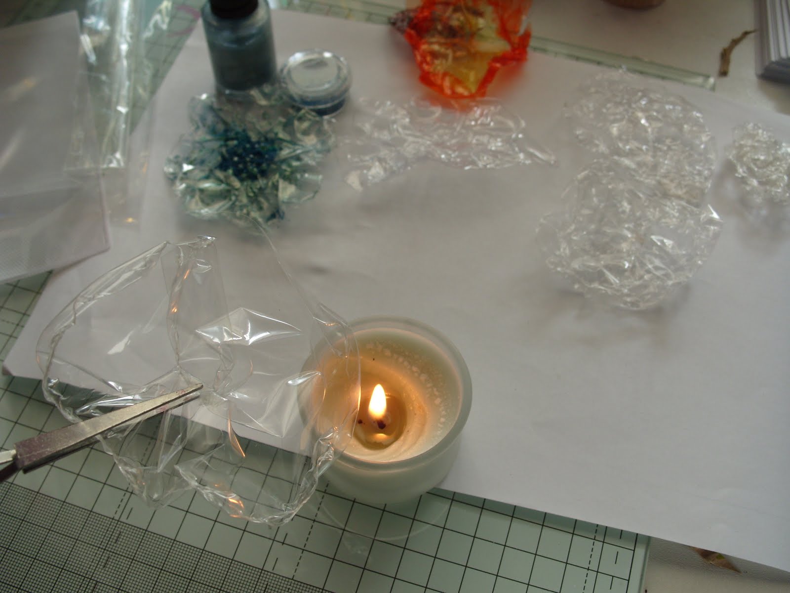
I have been having a fun time melting things.... heaven knows why!!! but as I was tidying up the kitchen I found myself forming the packaging into a flower. I wanted it to hold it's shape so switched on the gas ring and slowly melted it. I was quite pleased with the result it makes a very light weight flower and quite uncrushable for posting


I carried on playing in my craft room trying different sorts of cellophane, WORD OF WARNING!!!!!, one piece of packaging let off some horrible fumes and whilst none of them actually caught fire maybe it's best to have a tub of water nearby to extinguish any that might and certainly hold the plastic in tongs or tweezers.
I also tried with my heat gun....this was not so successful as using a flame, which was far more controllable.
I found layering some of the flowers quite effective and I tried decorating one of the test pieces with some pound shop nail varnish and some little beads that came from an accessory set that I picked up some time ago in a pound shop.


I created my own background paper with an old book page scrunched and tinted with pen ink (spritzed with water).


To disguise the mark on the quote (Printed on the PC) I inked round the edge with my daubers.
Finally I created some leaves from corrugated card, added a button and lightly glued the string into position.

Hopefully this card is suitable for some challenges :-
PAPERPLAY has SENTIMENTAL
ALLSORTS has MAKE YOUR OWN FLOWERS
ALPHABET CHALLENGE has QUOTES
and a new challenge site DREAM VALLEY has ANYTHING GOES
DARING CARDMAKERS also has a challenge using Poundshop finds so perhaps I will enter there as well.


Tuesday, 22 February 2011

Simply spotty!

I have been having a quick play making a card for a young girl. I have kept it quite simple and in a graphic style, so I haven't put a sentiment on the front as I didn't want to break up the shapes and colours.
I found some beads from a kit my girls had a long time ago, this generated the colour scheme. I sorted out some matching scraps and used a stationary punch to add my "spots".
I turned the beads into a "hanging charm" to add a bit of kinetic interest. I felt the paper spots were dull incomparison to the plastic beads so I added some clear nail varnish over the spotty topper, to give a final "shiny glaze".


Monday, 21 February 2011

Quick and simple.....I wish!!!!!


Well the afternoon is romping away and I desperately wanted to enter Clare's Weekly challenge which has a leaf inspired photo and I am determined to keep plugging on with my "keeping it simple" philosophy. Soooooooo ....I know ....I will knock up a quick card with a suitable sentiment and a bit of stencilling. ....ha ha ha ha.....this has taken me quite a bit of time!!!!... and quite honestly I know it's not quite right but as the deadline is ticking away I will post it anyway (then I really must feed my husband.....beans on toast if I don't get a move on!! he's hungry ooops).

LESS IS MORE has not only a Spring inspired challenge but some brilliant tips on creating word art. I really enjoyed exploring positioning of text but seriously know I haven't perfected it yet, not sure about the transparency thing...I had to use the "no fill" option in "format" and after creating my piece of work I found I couldn't then reposition it as a whole....there has to be away of grouping the entire piece and then moving???????? any help is gratefully received.


After I had created my word art I draft printed on paper to decide upon the positioning of my image.
I created a quick stencil by folding a piece of paper lengthways, roughly sketched one side of the leaf on the folded spine then cut out the shape. Once open I then cut the stalk.
I practiced on the draft print, then repeated the stencilling on a blank A5 piece of card.


I stencilled pen ink over the stencil using my homemade daubers (further details on the dauber tutorial). I used a yellow and a couple of greens....again I was disappointed with my colours... I would have preferred a much fresher brighter palette for spring. To create the spine detail I cut out some veins from the stencil off-cut. I reinserted the leaf and stencilled a darker colour.


I then repeated the process by shifting the stencil over to the side (first I used the stencil to cut another leaf to create a mask to place over the original stencilled leaf).
All that was left to do was print the sentiment and score the card in half. quick and simple...it wasn't.....Clean and simple...may be!?
All in all I was quite pleased. The proportions and positioning aren't exactly right, and possibly the leaves too big. I preferred it once I rounded the corners , not sure why, maybe it echoes the leaf shape and creates a bit of harmony (ooh that was a bit deep and pretentious!!).
(To round corners, place a glass tumbler on the corner and cut round with a sharp craft knife - use an emery board to sand down any blunt edges)
I love the sentiment and I firmly believe keeping it simple adds so much to the importance of the message, I hope to send this to someone I know who is feeling a bit down, as life is proving a bit tough at the moment....I think the proverb says it all.


Tuesday, 15 February 2011

Printing and "Puns"

I am getting serious withdrawal symptoms from my beloved stamping. As LESS IS MORE's CHALLENGE, is.. one layer cards with a "Flower or tree" theme, I thought I would struggle, as my budget cards rely very much on "sticking things" on etc.....undeterred I decided to go back to basics......finger painting or in this case printing.
My daughter is a huge Edward Monkton fan,true to form she bought oneof his cards for her boyfriend on Valentines Day. So I made my own homage to Monkton with some little bird (sitting in a tree!!) cards complete with corny pun's ...thought this would be suitable for ALLSORTS CHALLENGE which is "all about the sentiment"

The sentiment on the front then leads inside.....


Totally daft I know (I gave the card to Katie and James on Valentines and I think they were quite amused ?!?).

Then I saw that CREATIVE CRAFT CHALLENGE is "Cards for a teens"...always tricky particularly as we have quite a few in the family!! So I thought I would adapt the design for my niece (17).
Again going for a very cheesy pun..


and I will finish the song inside!!! at least she'll be spared me singing it!


The cards are so easy to make and I even managed to resist using an ink pad...inking my finger with a waterbased brush marker.......you would think waterbased would wash off.....


WRONG!!!!!!