Friday, 17 February 2012

Stripes and something very important…..

S1052440

Time has flown away again this week, so that has left very little time for Less is Mores’ challenge of Stripes, and there were so many things I wanted to try but I finally had to resort to an old favourite of doodling (where I originally started this blog). It really is the simplest way to create a card and funnily enough it always seems to get quite a response (hopefully positive) but I think people are always surprised if you have created something hand drawn. Of course the card is unashamedly “homemade” and I would never be ambitious enough to draw something properly but I do think everyone can doodle!! Consequently a little quirky doodled card has often elicited very favourable comments sometimes more than when I have slaved over my cuttlebug, stamps and backing papers!!!????? (not sure what that says about my card making!!)

S1052441

As you can see I did resort to the safety net of creating a stencil….basically another couple of egg shapes….similar to my birds….but this time ears and a tail…and ….tah dah….a cat!

I did have a quick play with some other ideas but ran out of time and it just wasn’t working so it was back to the doodling!!

But the other very important card which was very quick to make and is most propably going to take longer to explain ….

S1052438

This is a hello to a very special young man in America (this iron on motif has been lurking in my sewing things for an eternity so felt it would be better used on a card!).

If you follow “Ginger’s House” blog you will already know about Sebastian. Ginger creates wonderful free word art, is a very talented scrapbooker and a very talented writer….I love visiting her blog. She is also obviously a very special teacher as she decided to share her thoughts about one of her pupils and decided to appeal for people to send cards to this special young man. She explains it better on her blog so if you’re interested check out the Cards for Sebastian post.

It rang bells with me as I was fortunate to work with a very similar young man when he was about that age, and quite frankly in three years I think he taught me more than I taught him. My young friend had cerebral palsy, was quadriplegic, had many other related problems plus had also had a very rough start to his home life, but he was an amazing young man, smart, funny, entertaining and most of all compassionate to others…not bad for a 5 year old!

The main thing I learnt from my young friend was his condition was only one part of him, it had shaped who he was and to him it wasn’t a problem….in fact the only disabilities he had were the ones imposed on him by society. Living in his world for a while I realised how complicated society made his life, he was able to do most things if given the support and not presented with hurdles to constantly overcome.

……oh dear I could talk about this for ages…..and I mustn’t, as I sound like I am preaching but I wanted to explain why I wanted to join in Ginger’s Card drive for Sebastian. It’s a lovely opportunity to show that people do care, it doesn’t matter who or where you are, and it’s not about pity, it’s about recognising genuine worth.


Tuesday, 7 February 2012

Paper chains and doilies…..pinteresting!

Well I am spending far too much time trawling  Pinterest but it does throw up so many inspiring ideas.  One was a page from a french book with a diagram for cutting a chain of birds….it’s such an old technique  (remember cutting paperchains of dolls) but while we forge ahead with new exciting craft ideas we forget the simplicity of older techniques.

Less is More has Aqua as its colour theme (big HAAAAAPPPPPY BIRTHDAY!!!! Party smile  to them and congratulations on a very successful year, you deserve a big pat on the back for not only providing an inspiring blog but bringing so many crafters together).

The theme was perfect for revisiting the cutting idea…I cut a strip from an old envelope (Liz Earle’s promotional stuff has just the right colour for the challenge…. I do like Liz Earle products). After folding the strip into four panels (concertina style) sketched a little bird on the back, he is sitting on a branch which will create the joining element…..then cut it out.

S1052425Voila”…..one little row of birds ……ok so they still look a little prehistoric…..ala the bird stencil I created a couple of weeks ago……….. but they are hopefully recognisable (will really have to practice sketching birds, I didn’t take art at school because I couldn’t draw…..seems it was a wise decision…but then I promised myself many years ago that I was not setting out to be an artist…but that shouldn’t stop me having fun creating and crafting!!!!).

S1052420

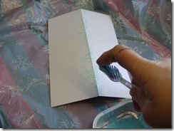
Not sure if I did the right thing but I decided to tone down some of the “white space” with more colour  (real reason was I was disguising a reject card that I had scored incorrectly).  A quick flick with and old toothbrush and some watered down emulsion paint and a bit more aqua was added.

S1052419

The other Pinterest find was creating an envelope from a doily….I changed the idea a bit as I felt it needed a liner. I have lot of large doilies left as Katie bought a big packet at Christmas to make some angel place cards (works xmas dinner)with the smaller ones (they had doily bodies and wings and a proper photograph of each persons head ….they looked so funny….especially the blokes!!!!!!!!!!!).

As I make a lot of my own card blanks I am always keen to make my own envelopes as well.   I simply used a matching piece of paper cut the same width as the card but folded round with a slight overlap.

S1052422

I placed this on the doily and folded the doily sides in. With a glue stick I attached the doily only where it came into contact with the lining paper.

S1052427

The eagle eyed amongst you will notice that I decided the birds needed wings…now not sure????? I truly am the most undecided person I know….or am I?!?!?!!!!!

I would also like to submit this for DYSU challenge this week as anything goes!! This is another lovely friendly challenge site and massively popular…. and as anything goes I will also include a pic of a little thank you gift I have just made with the scraps left over from my project….I needed to make some packaging for my Handmade hand scrub …..also inspired by Pinterest!!!

S1052428

….and if you check out Pinterest…..warning ….it is quite addictive…and can seriously reduce your crafting time.


Thursday, 2 February 2012

Faux Washi Tape

Warning…I have been playing!!!   ….spent ages fiddling and testing as I wanted to see if I could recreate Washi tape without spending anything extra but before I waffle, I will post the end result used on a card.  It was thanks to “Less is More” to give me a nudge to actually use my end products!  This week is a sketch, not normally one of my fave challenges but it instantly inspired me to use the tape and it was a good opportunity to make my hubbies valentine card

S1052404

S1052406     S1052408

I deliberately avoided the obvious valentine colours and my cards are often more about the words rather than the image. It was an extremely easy and quick card…..apart from the hours testing ways to make tape!!!! Oh and cutting out the lettering printed on the PC to create the message….fiddly!

Well this is how the tape turned out

S1052388

In the end I was quite pleased, but it is obviously not as instant as the proper washi/tissue/masking/decorative tape on the market as after creating the colour/ design I had to apply an adhesive to attach it, but the effect was very similar and the design can be tailored to the project.

I had to smile yesterday when my copy of Simply Cards and Papercrafts dropped through my door…there was an article on ……. creating WASHI TAPE!! The very talented Jo Kill has also been playing with the idea, she applied paper straight onto double sided tape, which obviously is better as the tape is instantly adhesive, and the effect is wonderful with tissue but other papers need reducing in thickness or it can just look like strips of paper stuck on. It was a fab article and the cards she produced with her tape are ….as always….stunning!

I wanted all my designs to have the same finish whatever their source, so I applied my designs under Scotch invisible sticky tape,  (actually I used a much cheaper brand for a lot of the test pieces), that way the top surface always had the same translucent effect on the top.

Initially I simply chalked (also used eyeshadow…which gave a lovely iridescent look) on the back (sticky side) of the tape, patterns can be created with strips of wax paper (backing off double sided!) or create a stencil or add punched shapes

S1052381         S1052391

I then moved onto transferring paper images, different papers needed different approaches…. some could…..

a) have the tape stuck straight on and cut out – great for tissue paper

b) burnished on and then ripped off (then trim sides)– great for fibrous paper , book pages, newspapers, old wallpaper

c) stick on tape, turn over,  lightly sand the back, brush back with water…..leave for a while….rub off backing paper – great for transfer of laser printed images, magazine images/text (I had generally poor results with the inkjet printed papers I tried)

S1052384

My next step was attaching the tape,  I was so pleased, I tried wet glues and dry glue (pritt), it didn’t affect any of the surfaces and several days on they haven’t dropped off despite leaving the test pieces on the windowsill. I applied the wet glue as a very thin layer with a glue spreader (an old plastic store card works just as well) and it was a lot quicker and easier than I anticipated.

S1052395

Still I had to try Jo’s version in comparison, not sure if you can see but there is a subtle difference, and both can be stamped on if required (I used stazon…mine took longer to dry). Cost wise Jo’s is a lot cheaper as I used Poundland double sided tape but based on using actual Scotch brand tape mine works out as    (but there are much cheaper invisible tapes available). My set of washi tape worked out as approx 30p a metre (bought a set of 5 different widths £14.25 + 1.50 p&p)

….and  the inspiration behind my card….. was a piece of tissue in a boot box which has “head over heels” written all over it…..I had to buy the boots….they were reduced from £80 to £6…..they were two sizes to big …...but I really wanted that tissue!!!!!!!!!!!!!!!!!!!!!!!!!!!!


Friday, 27 January 2012

Off to Peru…..

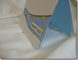
Not me, but someone we know is off to Peru to do some voluntary work, which means of course…another excuse to make a card…. I thought I would combine a good luck card with the LESS IS MORE CHALLENGE “Cut it out”

S1052358

I hadn’t considered framing the map until I saw the challenge and I must say I think that the great benefit of challenges, is it makes you consider different possibilities.

Once again the challenge lent itself to proper cardmaking equipment to create an aperture (badly wanted my cricut for this one….or my punches at least)but for my self imposed blog rules…… that left me with my trusty scalpel or scissors …..trouble is…. I am truly scissorly (not a proper word!!) challenged….and a bit lethal with a knife to!!

After printing a map  the appropriate size, I placed a piece of copier paper  over the image and with a pencil, lightly traced where I wanted to cut (needed to make sure Peru was visible).

To create the base card I used a 13 x 29.5 off cut of white card

S1052361

I put the paper template over the base card and cut over the lines with the knife.

After positioning the card pieces over the map I attached them in place with 3d foam pads, then scored the top fold and trimmed the excess from the back panel…..it all finished off with a greeting printed from the pc.

S1052368

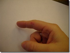
…….and you know what I said about me and knives…..well when I was putting the lid back on….. I managed to take a slice out of my finger!!

…at least I did less damage than poor Paul Daniels….. Disappointed smile


Thursday, 19 January 2012

When is CAS not CAS?

Well its one layer week at Less is More again, and I applaud Chrissie and Mandi for keeping us on the straight and narrow with the core rule of CAS which is as minimal as possible……and I thought I knew exactly what I wanted to do….but as I often find, I went completely off track….oops.

One layer is always difficult for me as it definitely lends itself to stamping (against my blog philosophy!). The theme lent itself perfectly to a card I wanted to make featuring one of my favourite quotes, which is the best way I know of conveying hope to someone when things seem at their darkest (sadly I have cause to make another one of these cards and I make it with a sad heart, but also with much love and care).

The quote is :- Faith is the bird that feels the light and sings when the dawn is still dark.   - Rabindranath Tagore
For once I decided I didn't want to use white, but the only scrap that I thought suitable was a strip of A4 flecked card…didn’t want to do another A6 so I decided to off set the spine to create a dl size. I had made my mind up to have just the words on the front and perhaps a little image inside but as the inside was to be visible I thought “this kills two birds with one stone!!”…perfect?!?…

S1052338

….and that’s where it went a bit wrong… I really think there is not enough “white/negative/empty” space for this to be truly CAS, plus it’s overly fussy for CAS

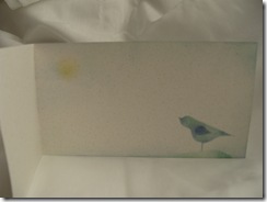
I made my own stencil for  the bird and used felt pen ink smudged on with my handmade daubers…as the bird appeared to be floating I “grounded” him by lightly stencilling over a torn paper edge

S1052334

inside I just twisted a dauber to give a faint hint of a sun and without reinking smudged some sky with the blue dauber…..then I got carried away and distressed around the edges with a little more ink….the final nail in the coffin I think, as far as CAS is concerned.

S1052337

So… not happy with the final result for the challenge I decided to use one of the other text boxes I created when I was playing with  the quote. BY the way I downloaded a fantastic free font from kevinandamanda.com called RAGE which I thought perfect for the word FAITH. I also used a dingbat font for the little scrolly details at the top (called Florals 2 from 1001 free fonts I think) .

I printed the text panel onto my normal square white card. I centralised it as it seemed a very formal arrangement.


S1052342

This is more the sort of CAS I am comfortable with….and I sat on my hands a resisted any urges to add any embellishments ….not even one itty bitty tiny one! (although I think a tiny bow at the top would have been quite nice!!)

I was going to add a little bird inside but when I created a smaller bird stencil  it ended up looking like a miniature Tyrannosaurus Rex!!!! so I gave up!!

Now… more importantly … off to look at the lovely creations I can see at Less is more.!!


Thursday, 12 January 2012

Purple and Poorly

No I am not purple (that’s for “Less is more”) but I am a bit blue because I well and truly have a “cold/flu/bug/virus??”… but still the cardmaking must go on and I have a card to make for a sixteen year old niece, plus I desperately wanted to join in with not only Less is More’s Predominately Purple challenge but also a challenge I have never joined in with before. St Luke's Charity Cards Challenge is a super idea where we can join in the fun and also if desired donate cards for them to sell for their worthwhile cause. As this months challenge is to reuse something on your card I had to join in as all my cards for my blog are made entirely with reused items, I only allow myself cardstock and glue to be bought specifically for the purpose.


S1052319


…………………DREADFUL!!!!!!!


I am completely happy with the idea that a card made for someone can be completely simple ……don’t get me wrong I LOVE playing with papers and techniques but honestly sometimes this doesn’t suit the recipient and I don’t think spending hours on a card (and boy have I spent hours on some cards!!!) means the card is more justified, I think people truly appreciate the gesture and it is a case of tailoring the card to the recipient ….BUT if it is going to be simple…it needs to be as perfect as possible and that manky row of bows clearly shows I have had one to many sips of cough mixture.


The ribbon was an “upcycled” piece (I think it was the hangy bit from inside some pyjamas…by the way who hangs up pyjamas???!!!) but it was single sided satin (which didn’t tie well) and I sniffed and snuffled throughout the procedure and quite honestly the bows look dreadful….so with that in mind …I give in…a lemsip and my sofa is calling and I will have to start again when I don’t need to keep permanently reaching for a tissue. Vicky the card might be a bit late!!


oh and …. I don't know why… I have a hang up with numbers on cards….often only comfortable with the written form…..am I batty?


Hope you all have a lovely …and germ free day!!


Monday, 2 January 2012

Toe in the water!


S1052301……from me!!!


I’m well and truly dipping my toe back in the water and gradually finding my way out of the blog hole I fell in.
Less is More has a One Word challenge and DYSU is looking for A Rainbow of Colours, so with last years resolution, to keep my cards simple I made a quick card with the word generated on the PC and then finished the word with a button.
Now for this years resolution….to become friends with blogging again….so far so good (Mass of hair…hope you are impressed …I finally got round to downloading Windows Live Writer and it really is much simpler to use…….my test post didn’t quite look like what I had created, it spaced out rather and altered sizes of font but hopefully blogging wont be quite so frustrating now…So big thank you for adviceand Suze if you use blogger this is a much friendlier way of creating posts…I just googled Windows Live writer and followed the instructions, there were several things to download i.e photo/video suites etc. but I just selected the “writer” bit…..I have to say I just blundered my way through the procedure and so far so good!!!! oh no famous last words Smile….ha ha …watch this space!!!!)


Well Happy New Year to you all! Time to post and go for a hop!!