Well its one layer week at Less is More again, and I applaud Chrissie and Mandi for keeping us on the straight and narrow with the core rule of CAS which is as minimal as possible……and I thought I knew exactly what I wanted to do….but as I often find, I went completely off track….oops.
One layer is always difficult for me as it definitely lends itself to stamping (against my blog philosophy!). The theme lent itself perfectly to a card I wanted to make featuring one of my favourite quotes, which is the best way I know of conveying hope to someone when things seem at their darkest (sadly I have cause to make another one of these cards and I make it with a sad heart, but also with much love and care).
The quote is :- Faith is the bird that feels the light and sings when the dawn is still dark. - Rabindranath Tagore
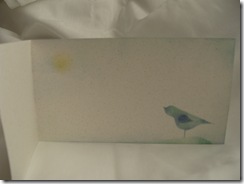
For once I decided I didn't want to use white, but the only scrap that I thought suitable was a strip of A4 flecked card…didn’t want to do another A6 so I decided to off set the spine to create a dl size. I had made my mind up to have just the words on the front and perhaps a little image inside but as the inside was to be visible I thought “this kills two birds with one stone!!”…perfect?!?…
….and that’s where it went a bit wrong… I really think there is not enough “white/negative/empty” space for this to be truly CAS, plus it’s overly fussy for CAS
I made my own stencil for the bird and used felt pen ink smudged on with my handmade daubers…as the bird appeared to be floating I “grounded” him by lightly stencilling over a torn paper edge
inside I just twisted a dauber to give a faint hint of a sun and without reinking smudged some sky with the blue dauber…..then I got carried away and distressed around the edges with a little more ink….the final nail in the coffin I think, as far as CAS is concerned.
So… not happy with the final result for the challenge I decided to use one of the other text boxes I created when I was playing with the quote. BY the way I downloaded a fantastic free font from kevinandamanda.com called RAGE which I thought perfect for the word FAITH. I also used a dingbat font for the little scrolly details at the top (called Florals 2 from 1001 free fonts I think) .
I printed the text panel onto my normal square white card. I centralised it as it seemed a very formal arrangement.
This is more the sort of CAS I am comfortable with….and I sat on my hands a resisted any urges to add any embellishments ….not even one itty bitty tiny one! (although I think a tiny bow at the top would have been quite nice!!)
I was going to add a little bird inside but when I created a smaller bird stencil it ended up looking like a miniature Tyrannosaurus Rex!!!! so I gave up!!
Now… more importantly … off to look at the lovely creations I can see at Less is more.!!


11 comments:
Both your cards are lovely. The second as you say is very CAS and I love the fonts you've used. But I also really like your first and don't think your extra sponging detracts from it at all. I love the sponged bird being seen with your text on the front. x
Both are masterpieces Diane, I love your little hand-drawn bird too and the inked edges are fine :) Your homemade daubers look the business...you're very resourceful :)
Jenny x
Quite beautiful!
Two beautiful CAS cards, I love the little tutorial,,and the green panel on the second card too.
Your cards are both beautiful Diane, and both beautifully CAS in style!
Great stuff!
Thanks so much
Chrissie
"Less is More"
I think these are gorgeous cards, especially the first one because of it's "little extra" shape of card.
Thanks too for the link, a great font.
Superb card Diane
What a twist of a dauber does!
Beautiful
Many thanks
mandi
"Less is More"
hi Diane, it is so sad when we have to make these cards but you made such beautiful ones and am sure they will be much appreciated.Love the little bird and the font is amazing, thank you for sharing.
Marie
your cards are lovely and you are too hard on yourself re the bird as it is lovely and CAS
I like both cards and it is a beautiful quote. The bird stencil does work, think you a little hard on yourself.
Hi there, Fabulous bird stencil, totally great shape and that font is brilliant, I love both cards. A very sensitive approach and a great success if you ask me:0) Gay xxx
Post a Comment