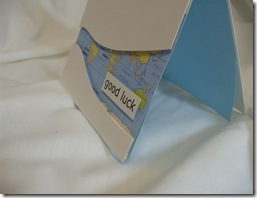
Not me, but someone we know is off to Peru to do some voluntary work, which means of course…another excuse to make a card…. I thought I would combine a good luck card with the LESS IS MORE CHALLENGE “Cut it out”
I hadn’t considered framing the map until I saw the challenge and I must say I think that the great benefit of challenges, is it makes you consider different possibilities.
Once again the challenge lent itself to proper cardmaking equipment to create an aperture (badly wanted my cricut for this one….or my punches at least)but for my self imposed blog rules…… that left me with my trusty scalpel or scissors …..trouble is…. I am truly scissorly (not a proper word!!) challenged….and a bit lethal with a knife to!!
After printing a map the appropriate size, I placed a piece of copier paper over the image and with a pencil, lightly traced where I wanted to cut (needed to make sure Peru was visible).
To create the base card I used a 13 x 29.5 off cut of white card
I put the paper template over the base card and cut over the lines with the knife.
After positioning the card pieces over the map I attached them in place with 3d foam pads, then scored the top fold and trimmed the excess from the back panel…..it all finished off with a greeting printed from the pc.
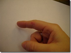
…….and you know what I said about me and knives…..well when I was putting the lid back on….. I managed to take a slice out of my finger!!
…at least I did less damage than poor Paul Daniels…..


10 comments:
What an ingenious card, love it so will the receivers. Oh! your poor finger, I bet that hurt, one good thing, the blood didn't go over your card LOL
Just brilliant Diane!
Superb card!
Thanks so much
Chrissie
"Less is More"
Diane, I really love this. So creative, different, outside the box.
Love the wavy aperture Diane :0)
You take care with those tools !
Jenny x
Love your take on the challenge and am sure the recipient will love it
Terrific card Diane
I sympathise with your finger, I did that with a bread knife the other week, painful!
Thank you very much
mandi
"Less is More"
Thank you for visiting my blog and your kind words. Your card is beautiful too. I really like the idea of a map in the middle. OD immediately brings to mind the long distance travel. And I love to travel.
Yours Halina (lin_ka1)
Love the wavy aperture with the map underneath. Very clever. Hope your finger is all better now. x
Absolutely stunning card Diane, sorry about the finger:{ but the cards great LOL xx
Hi Diane,
a friend of mine will graduate soon from a University in Berlin. I rememebered your post and I will definately make a card in this style with a map of Berlin that shows the University on it. Fun thing is, I know some librarians in Berlin who weeded out some old books and such. I asked them some time ago if I can have their old maps. Now they come in handy :-)
Thank you for sharing this wonderful idea.
Annabel
Post a Comment