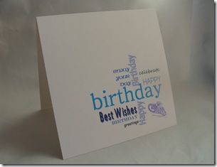
Excellent….. Less is More has “Script” for their challenge this week and I had just decided to revisit “Wordle” to create a quick card for one of my cousins. I thought a text based card would be ok for a bloke card. The colour was inspired by DYSU challenge who have asked for favourite colours (mine’s green but they did that last week, next best is Aqua….. so I abandoned my red and black theme for Aqua and blues.

The card was fun to create and easy but I thought I had gone off track with the theme….I looked up the definition of “script”- noun - the letters or characters used in writing by hand; handwriting, especially cursive writing, a manuscript or document, the text of a manuscript or document, the manuscript or one of various copies of the written text of a play, motion picture, or radio or television broadcast.any system of writing.
My design has got a couple of handwriting styles incorporated but I couldn’t resist having another quick go.
This is for my friends daughter who likes all things quirky so hopefully she will like a doodled/handwritten card. I decided to go all out with the Text theme and scanned a very old newspaper (hoorah for my mum being a top hoarder…mmm guess that gene runs in the family!!) which I printed directly onto card.
Again the card was quick and simple. To keep the “white space” as clean as possible. I draft printed the text, a quick doodle later…coloured in with coloured pencils, it was soon finished….I “ummed and arrred” over a bit of ribbon for embellishment…but decided to leave it alone…if I was using my card making stuff I would possibly use a shaped brad as an accent …but card making stuff is against my blog rules …….will have a rummage around the house….. inspiration might strike!!
Have just visited LIM and spotted a card with a similar idea to my first card, Debbie has created a great design with stamps and stickers, it’s very effective, and we have both chosen very similar colours (oops perhaps I should go back to red and black!!!).
….. if any one wants it


15 comments:
big gap warning....needed to edit something.. now the post has monstrous great gaps in it......SORRY!!!!! they wont go away!
DIANE
I like both cards - they'e great!
Thanks for your visit (and the link)!
Your card is great too!
I like the doodled one. The doodeling is very nice.
Debby
oh this is one,stunning CAS card just love the designs on both just so effective hugs Cherylxxx
Great cards Diane!
Thanks so much
Chrissie
"Less is More"
Super cards Diane
Thank you very much
mandi
"Less is More"
Great doodling and the text one is very clever. Super cards. xx
Great cards Diane, I really enjoy reading your blog. That was one of the reasons for giving you the award, along with all the fab tips and great ideas. Well done! xxx
Another great post Diane following your thought processes!! Never heard or tried wordle but looks like you did brilliant without it..... They look so easy to make the wordy collage but they are not!!!
Glad that newspaper counts as script ! Good job your mum had this old paper , they make a better background than today's chip paper!!!
Two excellent cards again this week Diane :0)
Jenny x
love the newspaper one!!! will have to look up wordle... really wanted to do a save the date design similar to how you have done your first card..
jen xx
Both are great cards! I'm amazed that you did these without benefit of stamps.
I love your texty cards-great job with both.
These work great. I love all the different texts together. x
I wish I could do simple looks
kitten - DYSU team
great cards Diane
Post a Comment