Thursday, 26 April 2012

Grilling…..again!!!

If you saw my flower post a couple of weeks ago, you will know I had a little adventure trying to dry out some soggy paper flowers (ok I know it wasn't my best idea) but this week in pursuit of making a charm for Less is More’s challenge I resorted to using my cooker for crafting again.

….and apart from a slightly “fumy” smell (toxic??? nah! at least I don't think so???) I was quite pleased with the result…but I wont post a pic of some of the interesting brown splodges I  originally created…it seems not all plastics are created equal!S1052595

To create a charm I found a piece of picture hanging wire in my kitchen “bit” draw…(tell me you all have one of these…its that  parking place for bits you don't know what to do with but cant quite bring yourself to throw away and I have to say its a useful place to find interesting things to craft with). After twisting a piece into a heart shape I couldn't help feeling it needed to be a bit more solid….so I decided it needed filling…I considered several ideas but decided it would be nice to have an faux enamel look and the only thing I could think of was to melt some beads in the centre.

S1052594but the best beads I found to melt so far were some of my girl’s old plastic play beads, (I think they’re called pony beads) and as most of them were highly fluorescent I had to just use the clear ones. I popped five beads in the shape and put it under the grill (on non stick baking paper). It took a while to melt but I was quite pleS1052596ased with the glassy look.

I originally planned this as a white card with black and red accents….but I resort to this so much I made myself use some coloured scraps…not entirely comfortable with it but it makes a change….

and I know my husband will love it whatever I make.  Its for our 28th Wedding Anniversary on Saturday. I based the card on a song that he has sung to me (he can be a bit of an old romantic at times!) I have put the  lyrics inside….if you dont know it, its sung by Heatwave, the song is by Rod Temperton a very talented man (also wrote Thriller!)…I love this song and the words are wonderful….I found a fab clip on Youtube… worth a watch particularly when you see the brave choice of outfits!!!!!!!!!!!  (Steve this is for you…just promise me one thing……never….ever….. wear a tight fitting pant suit!!!…. Always and Forever yours).


Thursday, 19 April 2012

Doodle heaven! ? ! ? !

Well Less Is More have excelled themselves this week as this week they have challenged us to doodle.

Now for me, with my “papercrafting on a budget” agenda I am……....                

but I am quite sure some Limettes may be thinking………….

I think it was quite a brave choice as so many of us are not happy putting pen to paper and I am certain I can hear the echoes of my own cry  ….”but I can’t draw!!!” …..I can’t …but I do love to doodle and I think a little hand drawn detail or message adds a great little personal touch. I have had such fun this week visiting some amazing blogs and wow there have been …without fail.. some stunning artwork…., but one of my fave cards is actually Lynne’s card, by adding a little puff off smoke she has completely changed her car from static to in motion…perfect solution to the challenge….. and then there have been some totally hand drawn cards which I couldn’t begin to pick a favourite as they are so superb. I am so impressed and a little daunted but again I have to give myself a little slap and remind myself that its the fun of creating that's important. I deliberately picked Purple Ronnie and Edward Munch artwork as it serves as a good reminder to me that actual realistic drawing often doesn't haven’t anything to do with art, both these pieces of artwork perfectly convey their meaning and I love them both.

……..So I have been scribbling doodling and generally getting inky… all to satisfy an “itch” that has been bothering me….. inspired by some pottery I recently saw where the glaze had settled into debossed details to create the pattern and Emmanuel Guibert’s technique of drawing with water… I have set about seeing if these ideas could be interpreted in papercrafting…or indeed if there is any value in them.

Well these are some of my test piecesS1052583…….

I have been comparing standard drawing using waterbased pens with “dry” doodling (have finally made myself an embossing tool with an old biro), I have experimented with different card (Guiberts technique definitely works best on paper and I really needed proper ink not just the watered down pen ink that I was working with). …and………….drum roll please…..the results…….. were………..…..a bit mediocre Disappointed smile!

The card I liked best was this one…I kept to my “lollipop” flower doodle which is often my default phone doodle.

S1052585S1052587

I did play with a couple of other tester cards……the right one I’m really not keen on…I can live with only having two flowers (generally I keep to the “odd number” rule) but they are far too large and clumpy.

The panel card was fun to create but it will most probably end up S1052582in recycling heaven.  I combined dry doodling with Guibert’s technique as I flooded the debossed doodle with water then wiped watered down pen ink over with a  pieces of sponge.  At first it didn't seem to have any effect but as it dried more of the pink ink was drawn  round the detail!

…. not exactly my finest hour….um hours. … Sorry its a long post…I could bore you more as I am a bit zealous about giving your own artwork a go but I wont run on anymore…but I will leave you with the  “notes” I made last week on a training course…

S1052593

……..well…. the information was all on printed handouts….but it was jolly nice of them to give me a paper and pen to play with!!!!!!!!!


Wednesday, 11 April 2012

Wobbly bits!!!!

In reality I have plenty of my own wobbly bitsEmbarrassed smile, but I have been planning to create a wobbly card for my God-daughter (great-great niece!!!) who is three this year, but I went right off track and instead of the “Hoppy” birthday card I was planning, I changed it to “Hoppy families” as a little congratulatory note for someone we know who has just announced their pregnancy (wonderful news).


As usual my inspiration came from Less is More who have a “Three greens” challenge but also DYSU who want “Friendly critters”, so it was a case of putting the two together to make my little family.


S1052572


S1052570


…and who needs brushes!!!


I have quite a few inherited acrylic paints from my girls, I adapted the green with yellow and blue…….


S1052571


…..daddy was darkened with the blue…mummy was the green unaltered and junior (who I have christened..Harry “Frogger” ) was lightened with yellow.


The bodies were quickly created with a few finger and thumb prints….after they were dry (note to self…in future wait till they dry ) I added some detail with a permanent marker and some white corrector pen fluid.


S1052574


Last night I spent ages creating elaborate little springs with wire and twisty ties but they were sadly lacking in the “wobble” factor and the answer was simply little “Z” shapes of acteate (not too thick…the first bit I used was too rigid) and I have to say they all wobble fantastically Winking smile


Now must quickly post this as….um er… should have left for work 5 minutes ago!!!!


Will have to do some blog hopping tonight (wont get home till 8 tho) or tomorrow.


Friday, 6 April 2012

Playing around…

You know the saying it’s not where you start its where you finish…well actually this week it’s more about where I started than where I finished. It’s been another mad week and I have had an idea buzzing in my head this week that I wanted to play with and it has been a case of flying in my craftroom whenever possible to have a little messy play.

It all started at the weekend when we assaulted a large Camellia in our garden. We tried to transplant it in Katie's cottage garden…..it didn’t go willingly and I fear for it’s survival but it was completely hidden in our jungle, the blooms are so beautiful so it was a shame to have it out of sight.

When I saw Less is More’s fabulous Picture inspiration this week I knew I had to have a go at capturing the beauty of the blooms in paper….ha ha.. easier said than done, especially without my crafting tools….reeeealllllllllly wanted to use my cricut but “hey ho” it was out with the scissors for a play.

S1052552I’m a big fan of Petaloo and Prima flowers and I have quite a lot of them but often never the right size or colours, so it was time to experiment making my own…the first one was a quick trial and actually ended up adorning the pot of sugar scrub which I had made as part of a friends present…

S1052568

I then had further play with some scraps of paper, exploring folds, multiple layers and different cuts…..not sure any of them actually look like Camellias but I have had a lot of fun creating them.  I found they moulded better  dampened and once dry they actually became quite robust.

TOP TIP no. 1…. if speeding up the drying process….don't put them under the grill S1052562and forget about them…the smell of scorched paper can last a long time in a house and having to leap about frantically trying to shut the smoke detector up is very frustrating…. but hey I think I have invented a new style of vintage flowers.
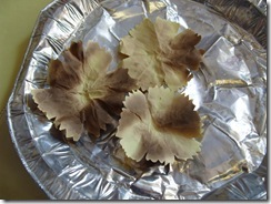
 

S1052558…the other conundrum was how to create the centres (this is how I got distracted from the grill!)…while I was in the kitchen I decided to dig out my food colouring and create some “pseudo” glitter with salt. I put a few drops of food colouring on table and rock salt….also tried some rice…this time I left it to safely dry on a radiator!!! …boring… had to wait till the next day in fact I had to tip it onto paper which did bleed some of the colour out but I was quite pleased with the end result. Trouble is when I put the salt on the wet glue, the rest of the colour bled out…so it was back to the drawing board…and quite honestly it was easier to just add the food colouring and salt directly to the glue.

TOP TIP n0. 2 Salt and Book Binding glue doesn't work…although NASA might be interested in the new “flubber” that I have invented!!!

I have spent so much time playing that actually there is very little time to make a proper flower and card, so this has to be the prototype card for the challengeS1052567

The great thing about renovating the cottage is I keep finding things I want to use in my papercrafting….The flower is mounted on a piece of Plasterboard “Scrim”, which quite handily is self adhesive…it reminded me of “Magic Mesh”…do you remember that trend, it was a long time ago…(bought some but never really used it!!! and I have to say I like the scim better).

I want to say a big thank you to Chrissie and Mandi for showcasing my card this week, but more importantly, for running such a wonderful challenge and the dedication you both have to everyone who joins in.  I truly appreciate your advice and comments.  Equally I appreciate the fabulous camaraderie that has developed from the challenge. I can’t express enough how much I appreciate people taking the time to visit me and tolerating my “homemade” approach to cardmaking.  I LOVE the inspiration I get from visiting other blogs, I only wish I could visit more, I try and get to see as many as I can.

Finally…particularly FAO: Jenny…remember “WOYCRF” (what’s on your craft room S1052569floor) …well this week its………………………..


TOP TIP no. 3 …when tipping dyed salt into a bag…remember to have the bag open!


Wednesday, 28 March 2012

Bling went bleuggh!…and “Just Because”

I’m not great at “blinging” my cards and it’s doubly difficult for my blog as I cant use any of my commercially produced cardmaking stuff…what I do have is some old iron on stones and some “Belly button” jewellery (very sparkly actually) that belonged to my girls.  I needed these for this weeks Less is Mores challenge. This week they have challenged us to combine three of the previous challenges, fab for me as this has given me chance to catch up on some challenges I missed when I fell into my blog hole last year.

I went back to Week 18 [Jun 4th]  Monochrome, Week 19 [Jun 11th]  In the Frame, Week 20 [Jun18th]  Monogram…..the only trouble is I had to abandon Monochrome as I needed to add a “touch of red” (Week 9) as the card began to look very Weddingy! (not a proper word), I bit the bullet and went for ……Week 43 [Nov 26th]  Bit of Bling.

S1052527

I found a fab frame here http://www.edupics.com/coloring-page-frame-i11330.html and used “RAGE” font inside a text box, to create a Monogram. I printed the design on my basecard and on a scrap of card, so that I could cut out the letter….I hate cutting out especially circles, generally I neaten cut edges by filing them,  this time I filed it from back to front to create a little gutter/ridge so that I could faux enamel the panel, it took two coats of nail polish to create a shiny finish and I found it easier to just tip it on….sadly this is where it went a bit bleauggh I had already stuck the diamantes into the first layer of nail varnish….the second layer went over them and just made them look like little clear dollops!!!!!!!!!

S1052522 S1052537

As this is a hand delivered card I went to town with the dimension and mounted the panel on corrugated card, this was covered with a scrap of ribbon tied round and finished with a bow. I loved the frame so much I decided to use it again and repeat the design on an insert but this time with the greeting inside.

S1052528

As I have sooooooo many weeks to catch up with I decided I had time to make a quick “Just because” card. These are some of my favourite cards to make….generally quite daft and for no real occasion….just because!!! I love leaving silly notes and cards for my family particularly if I think they could do with some encouragement or cheering up. I always left little hidden cards in my daughters school bags or lunch boxes….I have even hidden them in sandwiches!!!!

This little stone has been sitting on my desk since our last holiday and I thought he would make a cute mouse.

S1052526

Recipe for this one …..Week 18 [Jun 4th]  Monochrome (thought I better have another go)….Week 23 [July 9th] Something with Legs (if he was real…he would have legs!!!)……Week 28 [Aug 13th] Use Ink (*hang head sheepishly*…my pen had ink in it …does that count?)

Well the card was extremely quick to make…but rubbish to photograph….I know…I will photograph it out in the sunshine…..bad idea….my very needy cat thought I had come to lay in the grass with her and of course she had to get right under my noseS1052538 so I moved it…S1052541

S1052544moved it again..S1052546

and again ……and again….        S1052547       

ok I give up…

I will take your picture then!!!!!!!!!


She’s not bad for an old girl (17!) and no she isn’t winking she only has one eye!!!

………P. S. Steve….. the grass needs cutting


Sunday, 18 March 2012

Happy Day!

Happy Mothers’s day!!…I’m having a lovely pamper day, a break from the renovating the cottage, eating lots of yummy (and bad for you) stuff and of course crafting. YAY!!

This has meant I have actually had proper time to have a play with Less is More’s challenge of masking…naturally my fingers itched to use stamps but actually masking and stencilling is one of the easy ways to make cards without spending anything at all.

So it was back to the felt pens and daubers for this one

S1052510

Using a knitting needle punched through paper onto a soft mouse mat, created the torn circles. I keep a pot of buttons and coins on my desks as they make handy guides for projects that need small circles. I created three bushes on my tree for Allsorts “three in a row” challenge

           S1052501  S1052502

I then drew a flower pot and using “bog standard” tracing, repeated the design three times to create different elements of the pot.  The layers of colour were created by mixing colours together, then rubbing the ink over the masks, working from one side to build up light and shade. A final bit of texture was added to the tree by stippling the darker shade on with a piece of packing foam. The stalk was added on after the leaves and pot, masking the area required with post-it notes.

         S1052503 S1052505

I did find the dauber created a very subtle shade through such a small gap, so I used an off-cut from a Memory foam insole to get the ink into the gap which worked extremely well.  To finish I grounded the pot with a little bit of shading (masked with torn paper. The greeting was part of a much larger message on a recycled Birthday card.

CONFESSION: I cant even call it a school girl error as I think a school girl would have been more careful!! but I was so eager and gleeful in my extra crafting time I carelessly  wrenched the mask off my card, which I had diligently attached with masking tape…..you can guess what is coming …….there was …a hideous little tear on the side of my card. I had even de-tacked the tape on my p.js (yes I was crafting in my jammies…how decadent is that) but there it was …mocking me…oh well I like matting white on white…so no massive harm done.

After amazing, fabulous Eggs Benedict (cooked by Katie and James…and waited on by hubby Steve). It was straight back to the craft room for another version of the topiary tree. This time with the safety net of creating the elements separately, then decoupaging them onto the card. The message was from the same recycled birthday card but this time it was cut from the inside and pleated to create a banner.

S1052516

I have only now had the chance to post this, I have spent the rest of the day with Katie and Steve. We have turned an old kitchen shelf into a house sign for the cottage(using my cricut to cut out some lettering)….. we needed a new sign as the old one was attached to the front porch….which got into a fight with a Concrete Mixer Lorry on Tuesday…the mixer lorry won!!! ……and we have all just cuddled up and watched “One Day” with tea and a packet of crunch creams.

Red heart My wonderful mum died 16 years ago and today is always overshadowed by not having my daughter Gina here (I craft in her bedroom, so it is a  special place for me) but I am lucky and privileged to have had them in my life.

Red heart to my loved ones….Thank you for this special day,

Smile……and to you all who visit ….thank you for popping by and putting up with my ramblings. …..I hope you have had a lovely day.


Thursday, 15 March 2012

“Wordle” wont work

Excellent….. Less is More has “Script” for their challenge this week and I had just decided to revisit “Wordle” to create a quick card for one of my cousins. I thought a text based card would be ok for a bloke card. The colour was inspired by DYSU challenge who have asked for favourite colours (mine’s green but they did that last week, next best is Aqua….. so I abandoned my red and black theme for Aqua and blues.


S1052493The trouble is…Wordle wouldn’t work….I’ve got a feeling it’s something to do with Java….so having the attention span of a flea, I decided to abandon Wordle and just recreate the look with Text boxes and Word Art in Word. The bottom right corner looked a bit bare, so I inserted a little clip art pic of a motorbike (his great passion is bikes!) L.I.M. is one layer week but I did think my card needed a bit of a lift, luckily I had recently found a ridged ruler (in my big clearing the cupboard under the stairs frenzy) which was nearly perfect to create an embossed frame…actually it was a bit deep so I had to be careful.


S1052499 S1052500


The card was fun to create and easy but I thought I had gone off track with the theme….I looked up the definition of “script”- noun - the letters or characters used in writing by hand; handwriting, especially cursive writing, a manuscript or document, the text of a manuscript or document, the manuscript or one of various copies of the written text of a play, motion picture, or radio or television broadcast.any system of writing.


My design has got a couple of handwriting styles incorporated but I couldn’t resist having another quick go.


This is for my friends daughter who likes all things quirky so hopefully she will like a doodled/handwritten card. I decided to go all out with the Text theme and scanned a very old newspaper (hoorah for my mum being a top hoarder…mmm guess that gene runs in the family!!) which I printed directly onto card.


S1052498


Again the card was quick and simple. To keep the “white space” as clean as possible. I draft printed the text, a quick doodle later…coloured in with coloured pencils, it was soon finished….I “ummed and arrred” over a bit of ribbon for embellishment…but decided to leave it alone…if I was using my card making stuff I would possibly use a shaped brad as an accent …but card making stuff is against my blog rules …….will have a rummage around the house….. inspiration might strike!!


Have just visited LIM and spotted a card with a similar idea to my first card, Debbie has created a great design with stamps and stickers, it’s very effective, and we have both chosen very similar colours (oops perhaps I should go back to red and black!!!).


….. if any one wants itvintage newspaper scan_0001this is the scanned paper….I cant see a copyright on it and it’s old so hopefully not breaking any rules by giving the scan away…and I tried to steer clear of any mention of the macabre, murder or naughtiness…there was even mention of “wanton behaviour”….ooh er missus!!