Wednesday 14 September 2016

Good morning!!!!!!!!

Oh my goodness just opened my e-mails and see the lovely Leonie has posted my biog as I'm lucky enough to be invited to play along with her fantastic design team and her fantastic products....I knew Leonie would create products to inspire and she really hasn't disappointed.
Anyway as you can see by my patchy blog, spending time on the Internet is secondary to crafting! But I will try my very best to keep in touch.
If you do land here please introduce yourself, I love to know what people are up to ....any likes and dislikes ....what you have been up to ....
I'm off to Sheringham/Holt's Amazing Forties weekend...crafting time will be zero but it will be a lot of fun and naturally even amongst all the shops, stalls and sellers I will be looking out for things to incorporate  into my craft projects.....big fan of vintage buttons at the moment!
What about you? What's your craft obsession? 
Thank you for popping by, I'm so looking forward to playing along, I do hope you join in too, I always love to see what people have made. x x x 
P.s apologies for the daft photo on the email...too much wine! And I loathe having my pic taken 😁


Friday 6 May 2016

Prickles and papers....

I had a couple of cards to make this week.....one though was going to be a tricky get well/thinking of you sort of card ....for a bloke....and jokey wouldn't have been appropriate, I was a bit stumped until I saw City Crafters "feeling prickly"challenge....
Ah ha!  My young friend Emily has just started an online Etsy shop designing and selling her own die cut shapes...and they are fabulous. I'm not just saying it because she is very dear to my heart it's because they are beautifully made and very original .....including her her new set of  Cactii! .....perfect for a mans get well card.

I didn't want to just stick them on ... "job done" ...the diecuts are perfect for instant cards but I decided to use  Just Add Ink's circular sketch to create some movement round the card and the rest of the sketch for the placement of my diecuts and stamped tag.

......I was going to cheat and enter Less is More's Designer Paper challenge but I didn't choose the papers for the Die-cuts (although Emily does have a fantastic eye for colour and uses top quality card stock)  and as this blog is really about "have a go crafting on a budget" I decided to make my goddaughters "new home" card totally JUST ADD GLUE style

......So I hope Less is More will accept everyday designer paper ......an old road map...the inside of an envelope ...all stuck on a piece of card from my box of tea bags!!!
Teamed together with some hand doodled elements and some salvaged confetti.


"As you like it" asked for "favourite paper" and I have to say I have lots of specialist papers which I adore but I actually don't think you can beat an old map, or book page ......or inside of an envelope....does anyone else love the cute little designs inside envelopes???


Friday 29 April 2016

My hero

In honour of St George's day Less is More are having a Saints,dragons or heroes based challenge, so as yesterday was my 32nd wedding anniversary I thought I would make a dragon card for my hero...my husband.

I kept with the "Something blue" theme that Oak house Studio have had running this month, as I decided to use their ATC sized dragon. I had one problem as it seems another thing that suffered during the long storage of all my craft stuff is that some of my embossing powder seemed to have gone clumpy but interestingly the Oak house embossing powder which has also been in storage was perfectly fine and gave a much crisper finish.

Keeping in line with my Just Add glue principle I wouldn't allow myself any other proper crafting equipment so I had to resort to my controlled tearing method to create the aperture. (There is a tutorial about this method).


....and I told a fib ....I had two problems ....
......I really must learn to tidy up properly before I move onto my next project....I thought I had wrapped and chucked the painty rag I had just been using on a picture frame.....obviously not...still I managed to salvage the card so the mess was hidden inside and covered by the insert!!!

Happy anniversary Steve !!!....sorry about the paint 😁

....p.s as I failed with Less is More's challenge of white space but not white, I made my card completley navy.......and I did try and play along with the 3 stamp challenge but ran out of time and I completed the the one layer graphic challenge but after I had finished my card I put a great big thumb print on it ....aaaaagh ...anyway I did salvage the one layer card which was a simple doodled image on an Oak house stamp.....and used the same stamp for the three stamp challenge (this time I kept the book print to a minimum) ☺️ x 


Wednesday 27 April 2016

Upcycled blues.....

Oak House Studio are starting their "Take 5" summer challenge with "Something Blue".  For one of my projects I decorated a large jar candle with some homemade stickers. (details on the Oak House  Studio blog this month).

While I was making the stickers for my candle I decided to make myself a little tea light jar with the spare stickers and to hold the candle in place I used some of the Oak House Colour Chemistry (Jubilee blue) ink to dye some rice (a few drops mixed into the rice, then left to dry).

The jar was the finishing touch to a much larger upcycled project....for months I have been searching for a suitable vintage style, large mirror that had a shelf attached, but just couldn't find what I wanted. In the end Steve sanded our old mirror and attached a little shelf, this looked amazing but the two woods were very different....so out came the Colour Chemistry Inks and I very quickly painted/dyed both parts with Vintage Blue.To soften and create a distressed look I painted over with white eggshell. Although I made sure the ink was very dry I did spray a light coat of matt varnish to try and seal the blue as I think it would have bled into the wet paint. After sanding the paint back I sealed the whole thing properly with waterbased varnish.


I was so pleased with the finished mirror, I also upcycled an old stool for the bathroom (a handy hop up for my granddaughter) ..... I used the ink very diluted on this project and kept the wood more natural....I didn't want the stool to completely match plus there were so many layers of paint to strip back...each one leaving a hint of colour etc. and I loved the effect this created. The ink gave it a new look without spoiling the aged effect.....I really am a big fan of these amazing inks......now looking for more things to use them on!!!

Thanks for popping by and don't forget to check out Oak House Studio blog (for my jar candle) and shop......well worth a browse for some unique and fab products.

....and I would love to join in with my jar candle with some of the challenges


Friday 22 April 2016

April ....something blue....

I have been lucky enough to join Oak House Studio for their "Take Five" event. For the next five months five different designers will be challenged to use Oak House products on a chosen theme.....and I will be joining April's theme "something blue".
This has been a massive excuse to lock myself away with not only some of the very unique Oak House Stamps but their gorgeous, fantastic inks....so much fun in one little bottle ....and no I don't mean wine....good obviously ...but this is so much better for you....although if you don't wear rubber gloves (I DON'T) you will have an attack of the inky fingers.....who cares...I love it!!!!
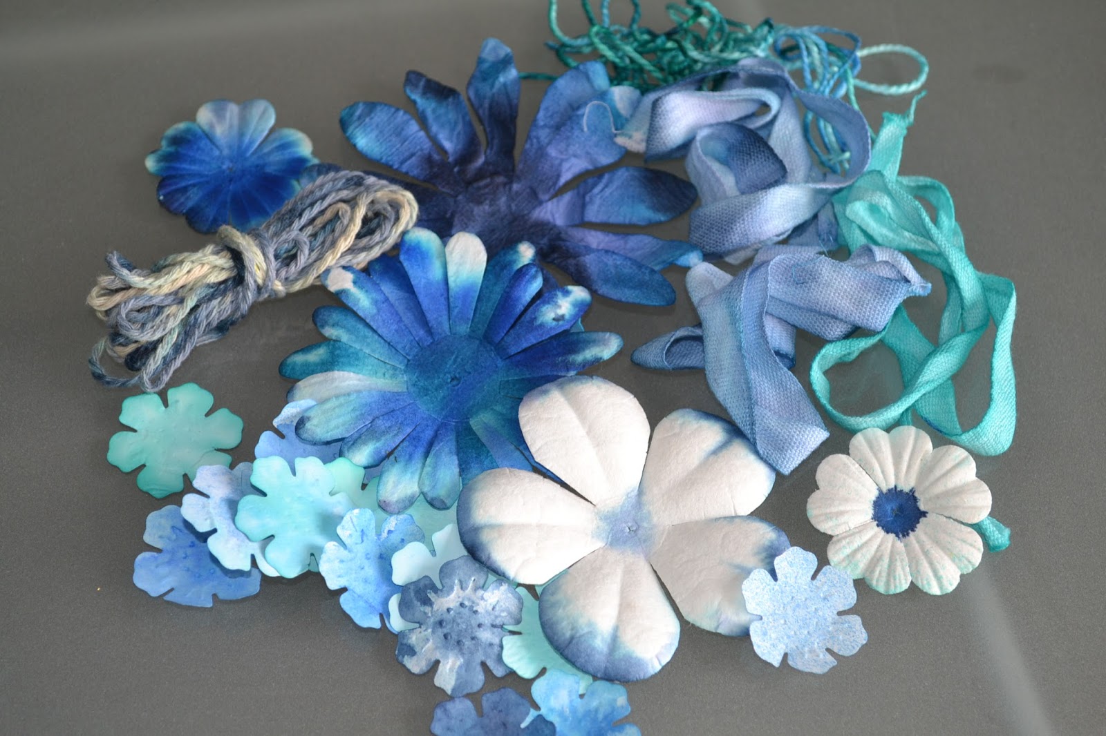
I have had so much fun, splatting, spraying dipping, dripping, dunking and dying....the possibilities are endless and I haven't limited myself to papercrafting.


Oak House very cleverly now sell all their inks in concentrated form which you can make into full bottles of regular strength spritzing ink plus have tons left over to use in different ways. I have been painting with them, dying paper, ribbons embellishments etc., adding them to different mediums and fully exploiting the fact you can dilute to change the intensity and mix the colours to create an incredible variety.

On the blog I made a CAS card with an inky background but I haven't got an envelope
 (I think I have warned you previously....don't store ALL your envelopes somewhere damp and cold....they like to seal themselves.....grrrr any one want to buy a couple of hundred pre-sealed envelopes?!)  .......so as this is my crafting on a budget blog I thought it would be good to make the envelope for my card and in contrast it would be ornate.

 This bit of paper was destined for the bin, it was just a protective backing piece when I was working but I loved it already had a panel masked out for writing the name.
Unfortunately it's not big enough ...time to get creative....using a scrap of paper and Oak House Pure Gold Acrylic ink (love this bottle of liquid gold....so shiny in real life) and a scrap of sponge,  I inked over the O.H. Thorseby Backgound stamp then spritzed over with diluted Jubilee Blue and Hey presto....instant posh verdigris....what fun...not intentional but one to remember....particularly as there is "rusting" technique I want to try.
 
Quite simply I glued the stamped panel over the top of the folded inked paper (fold edges in to form a slight overlapped join at back, then seal bottom edge with double sided tape), trim sides to match pouch and fold to create the flap.
....who needs proper envelopes.... ;-)

Check out the Oak House Studio Blog for my "bespoke" dyed tissue paper gift wrap,  plus all the other designers projects this month.....and of course the Shop for the amazing inks.


My card is also on the blog and I'd like to enter it into Hiding in my Craftroom's  "LOL" challenge.... it has actually got four layers (base, dyed panel, silhouette panel & word tab) ....this is quite a lot for me....not great with layers!!!!!!
....thanks for popping by :-)


Wednesday 6 April 2016

Q.A.S.........

should have been tidying my craft room....but I couldn't help myself make one more card  before I cleaned and tidied my Oak House Studio stamps away. I have been joining in with their summer challenge (5 months and 5 designers exploring 5 different themes)
I am joining in with April .....Something blue.


So one more Q.A.S (quick and simple) note card for a friend...
One damaged piece of card stock....covered with a vintage book page, pc printed greeting, Oak House Mountain Ash leaf stamp and midnight pigment Ink ...and the card was done it a couple of minutes ....it took longer to get the things together.

I wanted to staple the sentiment on but despite tidying my room (well more or less) I still haven't unearthed the stapler.....so I had to settle for a fake doodled one ...plus two more on the panel on the insert.
Hopefully my friend will enjoy the bosom heaving text of the page...and I am hoping that this is CAS enough for Less is More who are looking white space ....that is not white?!?!

.....and I apologise to Ethel M Dell ...but the book is already seriously damaged.....it does go against the grain to rip books but in this case I am hopefully putting it to good use rather than see it permanently destroyed!!!


Oak House Studio blog for inspiration and the Inkspired Facebook Page where you could join in adding your blue projects.... Check out the pages for details.

...thanks for popping by :-)


Thursday 10 March 2016

P.H.D..........projects half done.....plural...

Recently I had to make a sympathy card....I know that maybe the colours I used aren't typically sympathy colours but as the family have deep faith I thought that a warm glow in the background would reflect the important message of the cross.

....and the card isn't totally frugal "just add glue" as I did use a bought rubber stamp, the rest was created with felt pen ink and my daubers.....but I did think it would be possible to create the card completely without bought items....
.........So I added it to my to do/try/finish pile and yesterday... I noticed City Crafter has a challenge....do a PHD.....finish a project half done .......oh I could enter soooooo many times but as I was a bit stumped for Easter cards this year I wondered if I could adapt and actually finish my cross project. Less is more has a colour challenge of citrus and Hiding in my Craftoom is spring colours so I kept to the original colour palette of my sympathy card.
To create the cross I used a couple of pieces of thin corrugated card taped together, I cut a couple of different widths to recreate the shape. . .it did take a while to get the card inky enough and I did experiment with dragging the card to create a mistier effect not just stamping it for a cleaner effect, and as the brown in the pen set was a bit light I added some greens to darken it.
I quite liked all the effects but think I do prefer the stamped pieces.
The test pieces were just scraps, my chosen finished piece was actually one of the torn ones but I liked the effect and decided to copy the tearing on the opposite side.
I was quite happy with the finished image just mounted on Kraft card but thought perhaps for Easter it needed a bit more signs of life .....I doodled a little plant growing round the cross....again the pen wasn't a good colour so I used a little highlighter pen to brighten the leaves.
While the inks we're out I also needed to make my friends card....now this is where I need some advice...originally this was completely c.a.s....design on a white card blank....but as my friend has just started card making and is favouring a more decorative style, I was worried she might think I had not gone to a lot of trouble ....so I chopped it off to layer on coloured card stock with some decorative mats and layers and embellishments.....but I got cold feet...I'm just not comfortable with lots on a card. So far I have just suspended it on some ribbon ...and added some some faux embossed stitching on the base card

oh and a little detail on the back....and stamped detail inside....
Plus 

hidden sentiment under the giant tag
.....(I know there is a little sentiment on the front but am hoping this qualifies for Creative moments challenge).
Anyway.....
Should I have layered it.?
Added bows, brads, lace and/or embellishments?
Put stitching round the panel/tag?
Use a corner rounder on the panel?
Heat Embossed the stamped image?????? 
Is it missing something......I have till Sunday to change it?
Would appreciate any opinions always nice to have a fresh pair of eyes look at it objectively ............and while I am at it I must say thank you to my two new followers who have joined me since I have been back..... I really appreciate everyone who pops by and takes the time to comment.